Grid 屬於父層設定的 Layout,可直接在父層以 grid-template-rows 定義 row 的高度與個數。
Version
CSS 3
Height
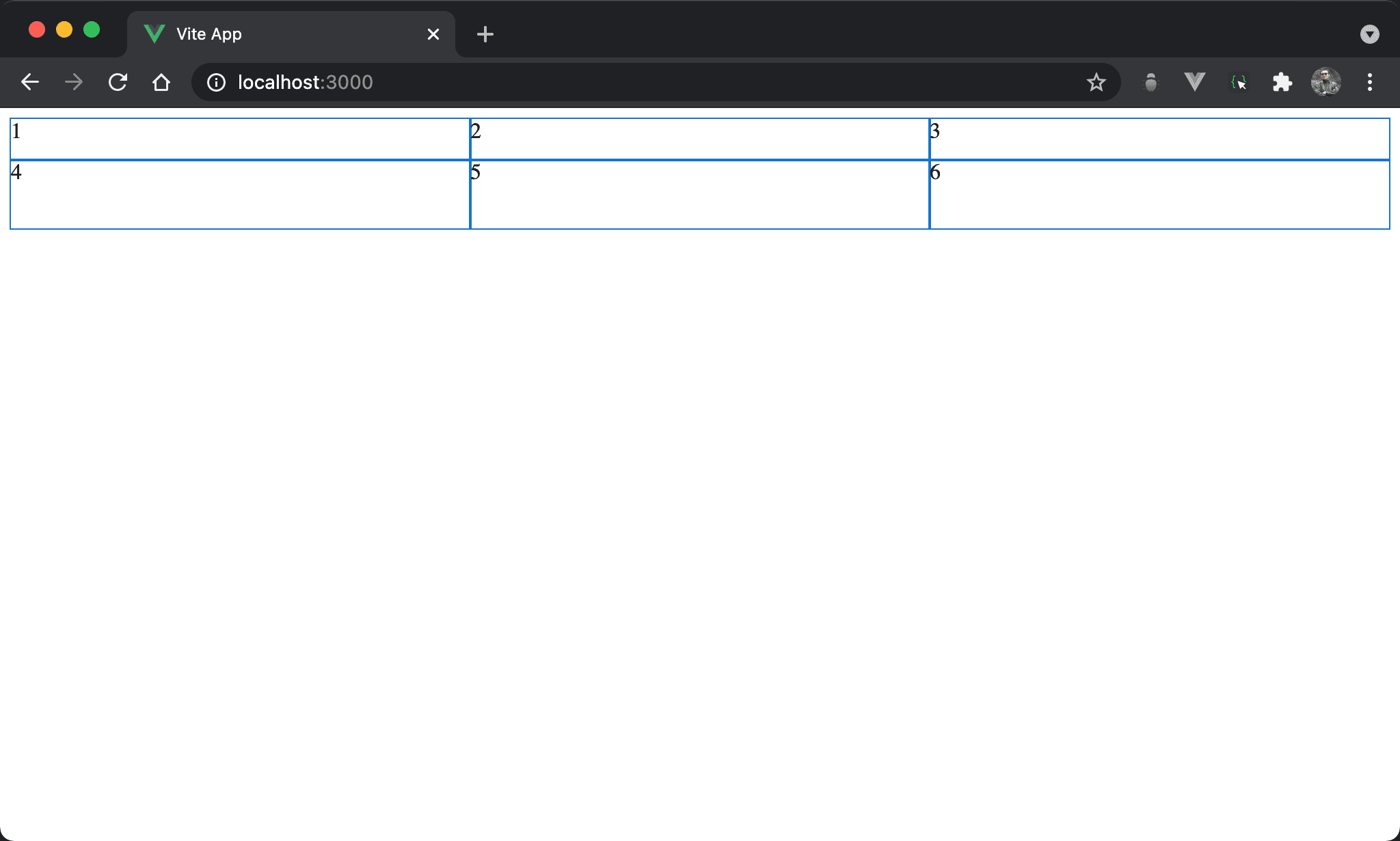
產生 2 x 3 排版但高度自行決定。
<template lang='pug'>
section
  div 1
  div 2
  div 3
  div 4
  div 5
  div 6
</template>

<style lang='sass' scoped>
section
  display: grid
  grid-template-columns: auto auto auto
  grid-template-rows: 30px 50px
</style>
13 行
section
  display: grid
  grid-template-columns: auto auto auto
  grid-template-rows: 30px 50px
設定父層 section style:
display: grid:設定子層使用 Gridgrid-template-columns: auto auto auto:argument 個數決定 column 個數,若要由 browser 自行根據剩餘寬度分配則填入autogrid-template-rows: 30px 50px:由父層直接設定每個 row 的高度
若不設定高度,則預設為
none,也就是由 content 決定高度
grid-auto-flow: column
結果不變,但使用 grid-auto-flow: column 改寫。
<template lang='pug'>
section
  div 1
  div 2
  div 3
  div 4
  div 5
  div 6
</template>

<style lang='sass' scoped>
section
  display: grid
  grid-auto-flow: column
  grid-template-rows: 30px 50px
</style>
12 行
section
  display: grid
  grid-auto-flow: column
  grid-template-rows: 30px 50px
若覺得 grid-template-columns: auto auto auto 寫法很蠢,也可改由 grid-auto-flow: column,表示由 browser 自行根據 grid-template-rows 設定決定 column 數。
Conclusion
grid-template-rows最大貢獻在於在父層就可決定子層 item 的 row 個數與 row 高度,這是 Flexbox 做不到的