Flexbox 的 justify-content: space-around,事實上也能使用 margin: auto 簡單實現。
Version
CSS 3
space-around

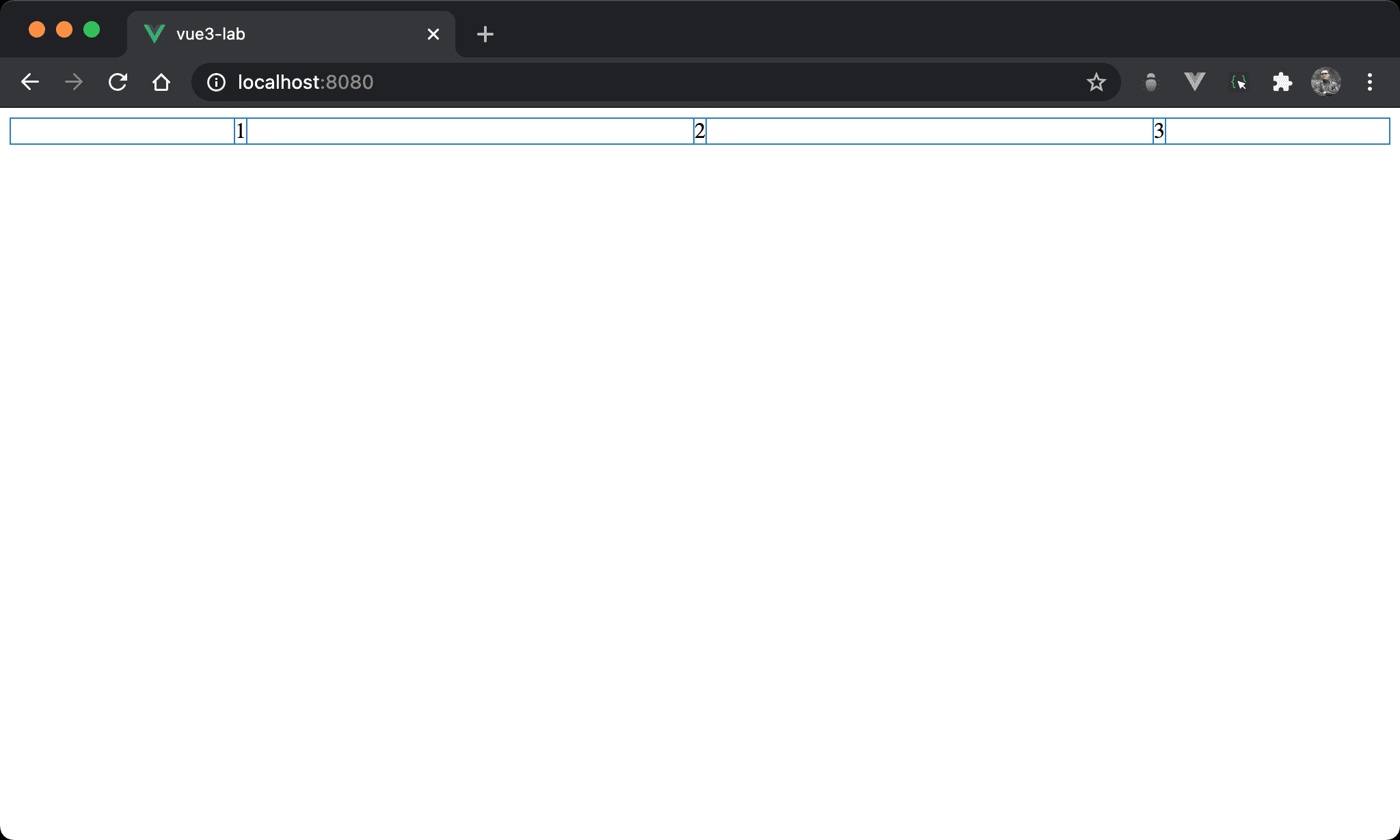
Item 之間的間隔相等,2 看起來水平置中,且 1 左側與 3 右側間隔只有其他間隔一半。
<template>
  <div class="box">
    <div>1</div>
    <div>2</div>
    <div>3</div>
  </div>
</template>

<style scoped>
.box {
  display: flex;
  justify-content: space-around;
}
</style>
10 行
.box {
  display: flex;
  justify-content: space-around;
}
display: flex:使用 Flexboxjustify-content: space-around:item 之間的間隔平分 container 剩餘寬度,但第一個 item 與最後一個 item 的左右側間隔為其他間隔的一半
margin: auto
改用 margin: auto,但結果與 justify-content: space-around 相同。
<template>
  <div class="box">
    <div class="item">1</div>
    <div class="item">2</div>
    <div class="item">3</div>
  </div>
</template>

<style scoped>
.box {
  display: flex;
}

.item {
  margin: auto;
}
</style>
10 行
.box {
  display: flex;
}
display: flex:一樣使用 Flexbox
14 行
.item {
  margin: auto;
}
margin: auto:各 item 間 margin 由剩餘 width 自動分配
由於各 item 的 margin 都相同,因此第一個 item 與最後一個 item 的左右側間隔為其他間隔的一半
Conclusion
margin: auto在 Flexbox 下能實現不少特殊效果,連 Flexbox 的justify-content: space-around也能實現