若要同時水平置中與垂直置中,直覺會同時使用 justify-conten: center 與 align-items: center,事實上也可巧妙地使用 margin: auto 實現。
Version
CSS 3
margin: auto
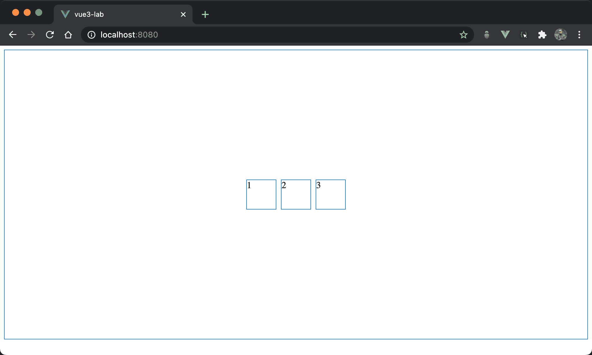
Item 在 box 內同時水平垂直置中。
<template>
  <div class="box">
    <div class="item item1">1</div>
    <div class="item">2</div>
    <div class="item item3">3</div>
  </div>
</template>

<style scoped>
.box {
  display: flex;
  height: 500px;
}

.item {
  width: 50px;
  height: 50px;
  margin: auto 5px;
}

.item1 {
  margin-left: auto;
}

.item3 {
  margin-right: auto;
}
</style>
第 2 行
<div class="box">
  <div class="item item1">1</div>
  <div class="item">2</div>
  <div class="item item3">3</div>
</div>
box:使用box設定 containeritem:設定 item 共用 propertyitem1、item3:設定1與3特有 property
10 行
.box {
  display: flex;
  height: 500px;
}
display: flex:使用 Flexboxheight: 500px:設定 box 的 height
15 行
.item {
  width: 50px;
  height: 50px;
  margin: auto 5px;
}
設定各 item 共用 property:
width: 50px:設定各 item 的 widthheight: 50px:設定各 item 的 heightmargin: auto 5px:設定各 item 的 vertical margin 為auto,hortizontal margin 為5px
21 行
.item1 {
  margin-left: auto;
}
設定 item1 特有 property:
margin-left: auto:使用auto取代5px,因此 item1 能自動調整 left margin 達成水平置中
25 行
.item3 {
  margin-right: auto;
}
設定 item3 特有 property:
margin-right: auto:使用auto取代5px,因此 item3 能自動調整 right margin 達成水平置中
Conclusion
- 之所以能夠使用 vertical magin 為
auto實現垂直置中,主要原因是display: flexbox下的 box 已經設定 height,因此對於 item 而言有上下 margin,才可使用margin: auto垂直置中,但一般 box 沒有 height 而是由 item 撐開,此時並沒有上下 margin 可言,因此margin: auto也無濟於事