若希望 Browser 能自動均分 section 剩餘寬度,可使用 justify-content 的 space 系列設定。
Version
CSS 3
justify-content space-evenly
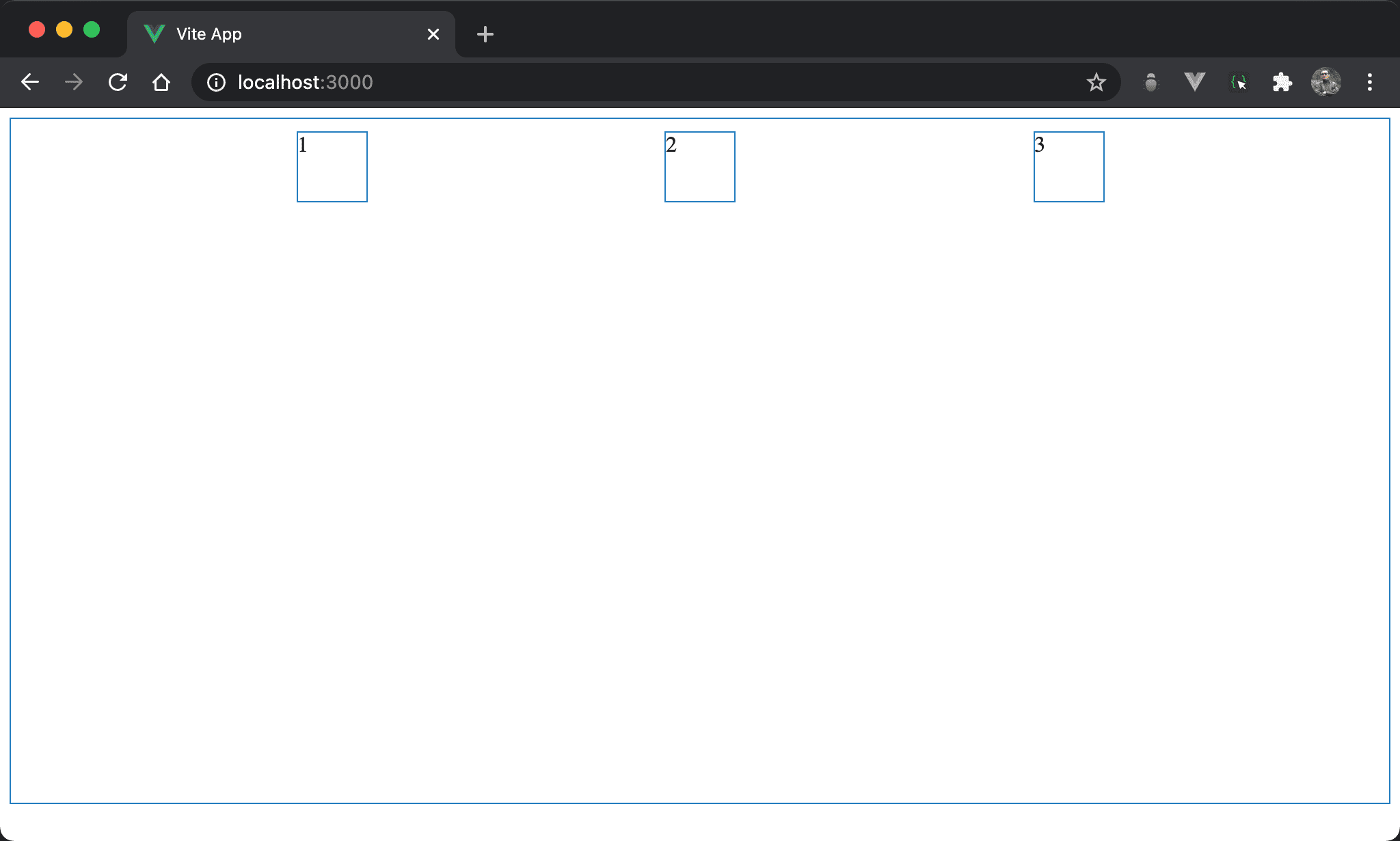
Item 之間的間隔相等,2 看起來水平置中,連 1 左側與 3 右側間隔也與其他間隔相等。
<template lang='pug'>
section
  div 1
  div 2
  div 3
</template>

<style lang='stylus' scoped>
section
  display flex
  flex-direction row
  justify-content space-evenly
  width 100%
  height 500px

div
  width 50px
  height 50px
  margin 10px
</style>
第 9 行
section
  display flex
  flex-direction row
  justify-content space-evenly
  width 100%
  height 500px
設定 section style:
display flex:設定子層使用 Flexboxflex-direction row:表示水平由左至右,main axis 為 row,這也是 Flexbox 預設值justify-content space-evenly:item 之間的間隔平分section剩餘寬度,且第一個 item 與最後一個 item 的左右側間隔也與其他間隔相等
16 行
div
  width 50px
  height 50px
  margin 10px
設定 div style:
width 50px:設定div寬度height 50px:設定div高度margin 10px:設定divmargin
Conclusion
- 實務上
space-between與space-evenly較常使用,可平分section剩餘寬度