若希望能對 Main Axis 方向靠右,可使用 justify-content flex-end 設定。
Version
CSS 3
Column Right
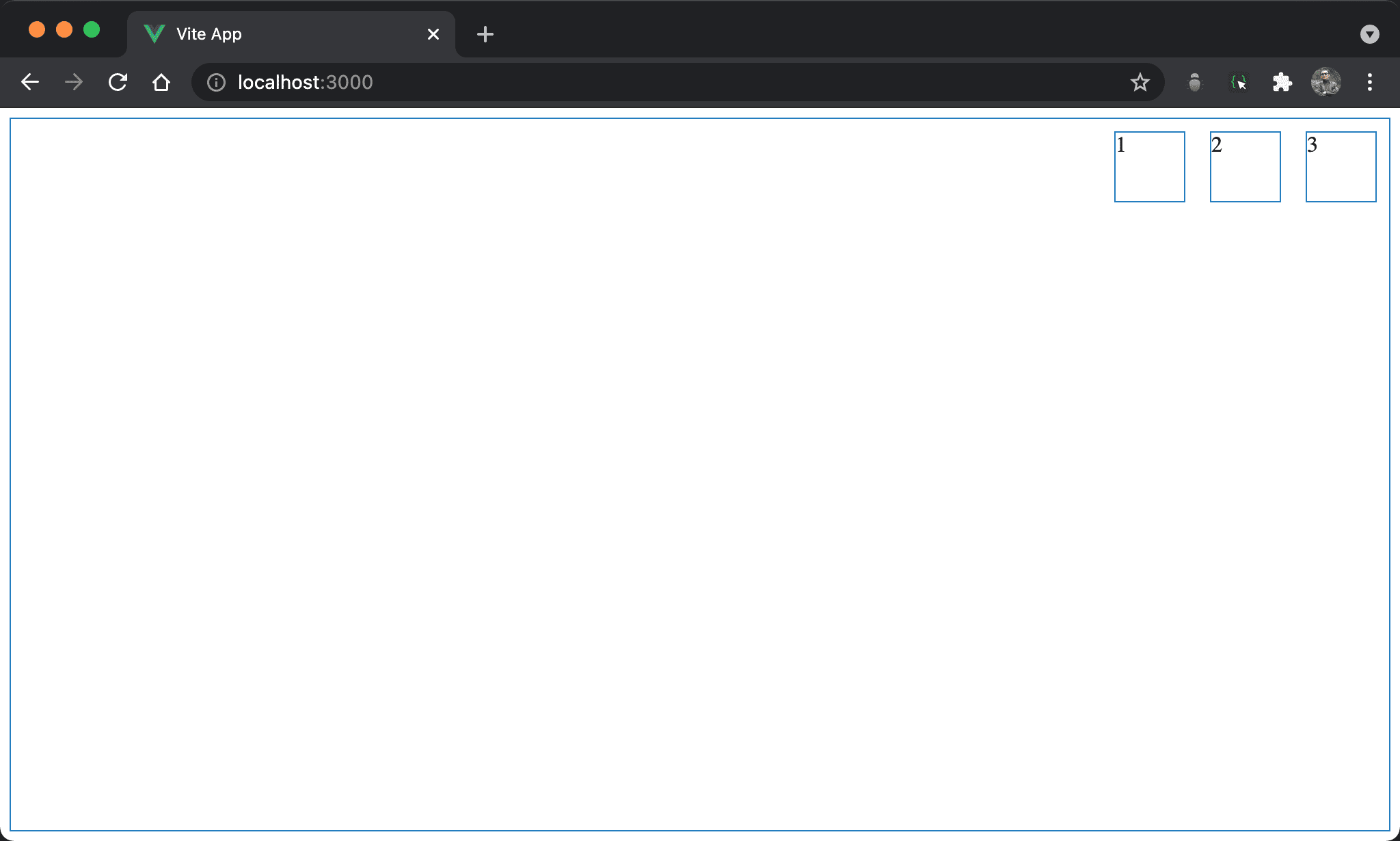
子層 item 靠右對齊,但內容 123 從左開始。
<template lang='pug'>
section
  div 1
  div 2
  div 3
</template>

<style lang='stylus' scoped>
section
  display flex
  flex-direction row
  justify-content flex-end
  width 100%
  height 97vh

div
  width 50px
  height 50px
  margin 10px
</style>
第 9 行
section
  display flex
  flex-direction row
  justify-content flex-end
  width 100%
  height 97vh
設定 section style:
display flex:設定子層 item 使用 Flexboxflex-direction row:表示水平由左至右,main axis 為 row,這也是 Flexbox 預設值justify-content flex-end:因為由右至左,所以 item 也是靠右對齊width 100%:設定section寬度height 97vh:設定section高度
16 行
div
  width 50px
  height 50px
  margin 10px
設定 div style:
width 50px:設定div寬度height 50px:設定div高度margin 10px:設定divmargin
Content Right
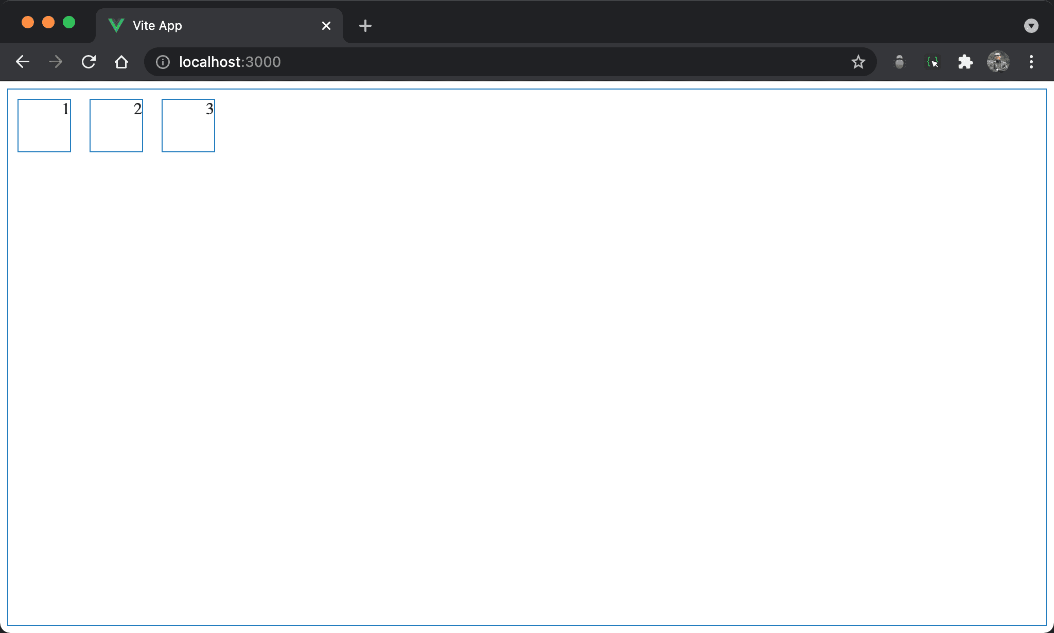
子層 item 水平靠左,但內容 123 也水平靠右。
<template lang='pug'>
section
  div 1
  div 2
  div 3
</template>

<style lang='stylus' scoped>
section
  display flex
  flex-direction row
  width 100%
  height 97vh

div
  display flex
  justify-content flex-end
  width 50px
  height 50px
  margin 10px
</style>
第 9 行
section
  display flex
  flex-direction row
  width 100%
  height 97vh
設定 section style:
display flex:設定子層 item 使用 Flexboxflex-direction row:表示水平由左至右,main axis 為 row,這也是 Flexbox 預設值width 100%:設定section寬度height 97vh:設定section高度
15 行
div
  display flex
  justify-content flex-end
  width 50px
  height 50px
  margin 10px
設定 div style:
display flex:在每個div再度使用 Flexboxjustify-content flex-end:讓div內 content 水平靠右width 50px:設定div寬度height 50px:設定div高度margin 10px:設定divmargin
Conclusion
- 若
flex-direction設定為column,則 main axis 為 column,justify-content則對 column 方向對齊 justify-content flex-end有兩種用途:若用在父層則是將所有 column 水平靠右;若用在子層則是將 content 水平靠右