若要同時設定 flex-direction 與 flex-wrap,可使用 flex-flow 縮寫一行完成。
Version
CSS 3
flex-direction vs. flex-wrap
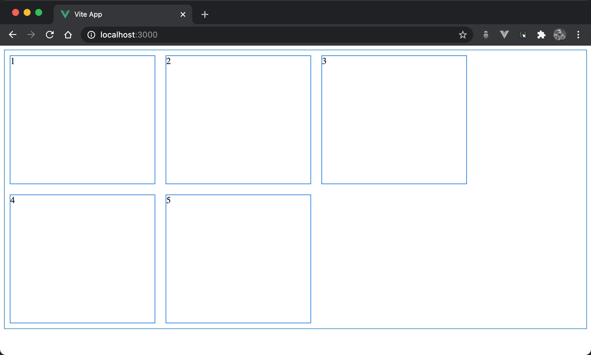
子層 item 以水平方式排列並換列顯示。
<template>
  <div class="box">
    <div class="item">1</div>
    <div class="item">2</div>
    <div class="item">3</div>
    <div class="item">4</div>
    <div class="item">5</div>
  </div>
</template>

<style scoped>
.box {
  display: flex;
  flex-direction: row;
  flex-wrap: wrap;
  width: 100%;
  height: 90vh;
}

.item {
  width: 250px;
  margin: 10px;
}
</style>
12 列
.box {
  display: flex;
  flex-direction: row;
  flex-wrap: wrap;
  width: 100%;
  height: 90vh;
}
設定父層 box style:
display: flex:設定子層 item 使用 Flexboxflex-direction: row:設定 main axis 為 row,也就是水平排列flex-wrap: wrap:設定當子層 item 總 width 超越父層 box 時自動換列width: 100%:設定父層 box widthheight: 90vh:設定父層 box height
flex-row

子層 item 以水平方式排列並換列顯示。
<template>
  <div class="box">
    <div class="item">1</div>
    <div class="item">2</div>
    <div class="item">3</div>
    <div class="item">4</div>
    <div class="item">5</div>
  </div>
</template>

<style scoped>
.box {
  display: flex;
  flex-flow: row wrap;
  width: 100%;
  height: 90vh;
}

.item {
  width: 250px;
  margin: 10px;
}
</style>
12 行
.box {
  display: flex;
  flex-flow: row wrap;
  width: 100%;
  height: 90vh;
}
設定父層 box style:
flex-flow: row wrap:將flex-direction: row與flex-direction: wrap以flex-flow一行表示
Conclusion
flex-row讓我們原本需要兩行設定簡化成一行