Flexbox 雖然看起來使 Block 從垂直排列變成水平排列,事實上是由 flex-direction Property 決定 Main Axis 排列方向。
Version
CSS 3
row
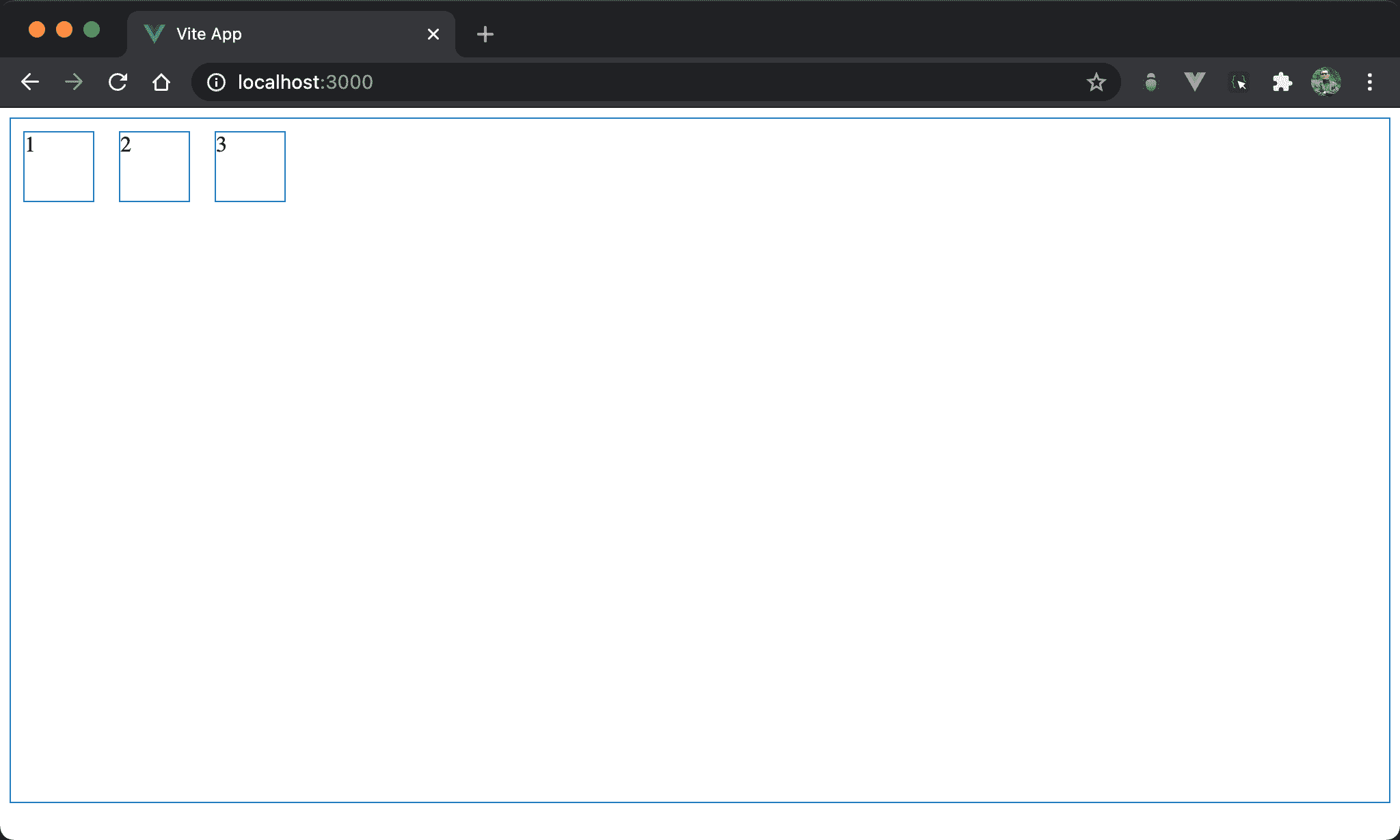
Flexbox 預設為由左向右水平排列。
<template>
  <div class="box">
    <div class="item">1</div>
    <div class="item">2</div>
    <div class="item">3</div>
  </div>
</template>

<style scoped>
.box {
  display: flex;
  width: 100%;
  height: 500px;
}

.item {
  width: 50px;
  height: 50px;
  margin: 10px;
}
</style>
10 行
.box {
  display: flex;
  width: 100%;
  height: 500px;
}
display: flex:使用 Flexbox,預設為水平由左至右,也就是預設為flex-direction: row,因此 main axis 為 row
row-reverse
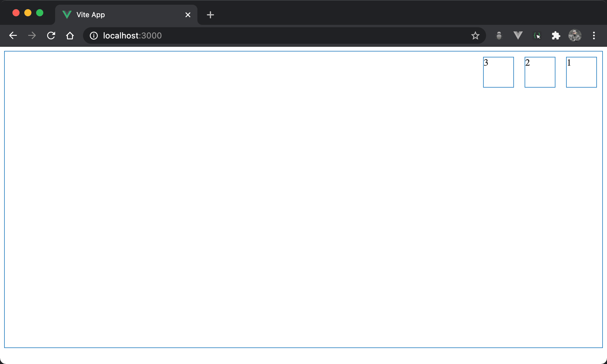
改成由右向左水平排列。
<template>
  <div class="box">
    <div class="item">1</div>
    <div class="item">2</div>
    <div class="item">3</div>
  </div>
</template>

<style scoped>
.box {
  display: flex;
  flex-direction: row-reverse;
  width: 100%;
  height: 500px;
}

.item {
  width: 50px;
  height: 50px;
  margin: 10px;
}
</style>
10 行
.box {
  display: flex;
  flex-direction: row-reverse;
  width: 100%;
  height: 500px;
}
display: flex:使用 Flexboxflex-direction: row-reverse:將 Flexbox 改成水平由右至左排列
column
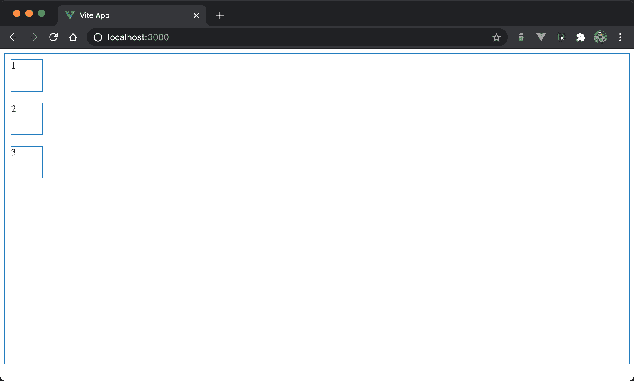
改成由上向下垂直排列。
<template>
  <div class="box">
    <div class="item">1</div>
    <div class="item">2</div>
    <div class="item">3</div>
  </div>
</template>

<style scoped>
.box {
  display: flex;
  flex-direction: column;
  width: 100%;
  height: 500px;
}

.item {
  width: 50px;
  height: 50px;
  margin: 10px;
}
</style>
10 行
.box {
  display: flex;
  flex-direction: column;
  width: 100%;
  height: 500px;
}
display: flex:使用 Flexboxflex-direction: column:將 Flexbox 改成垂直由上至下排列,main axis 為 column
若要垂直且由上至下,其實不用
display: flex與flex-direction: column亦可,因為<div>為 block,視覺效果完全相同
column-reverse
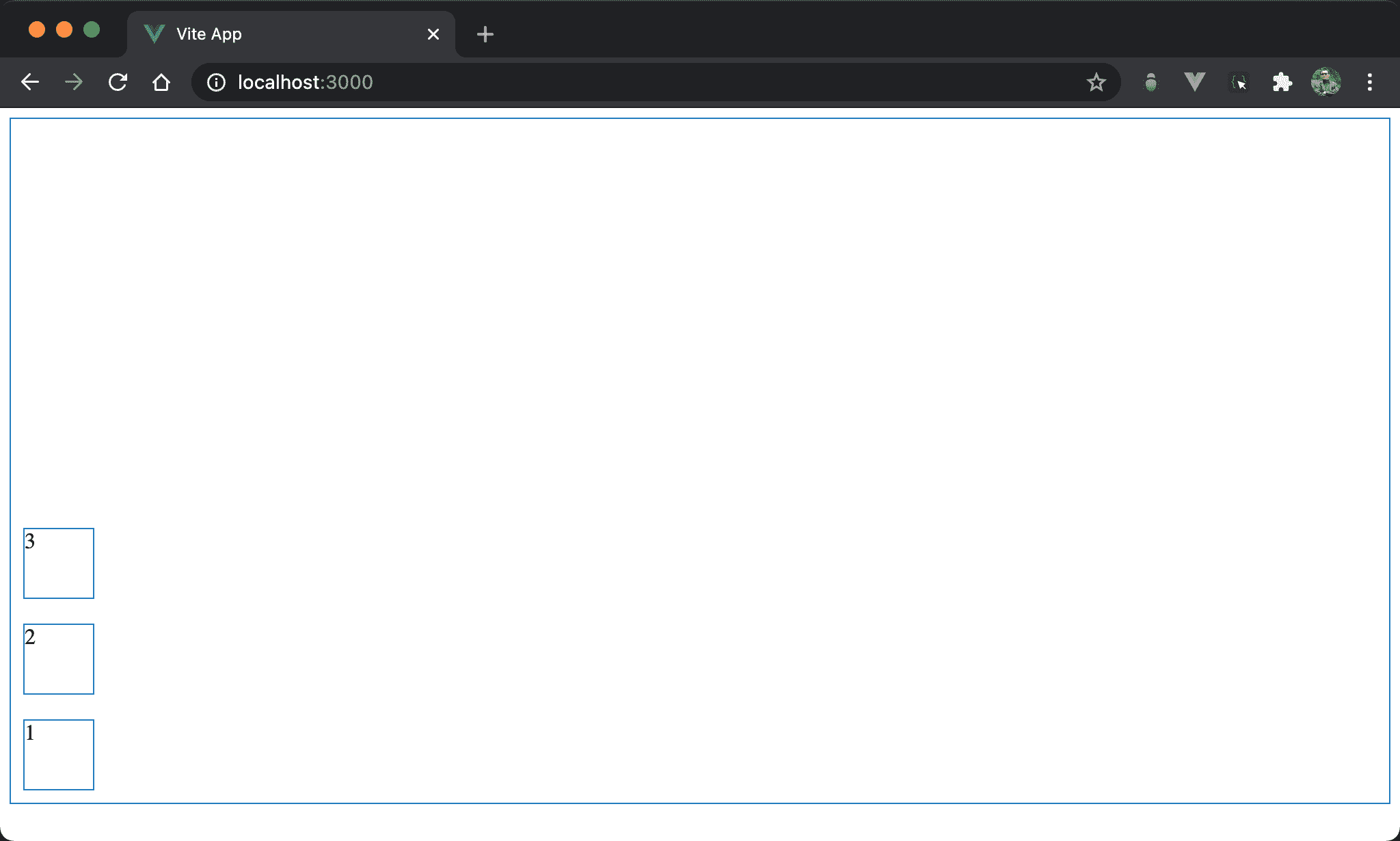
改成由下至上垂直排列。
<template>
  <div class="box">
    <div class="item">1</div>
    <div class="item">2</div>
    <div class="item">3</div>
  </div>
</template>

<style scoped>
.box {
  display: flex;
  flex-direction: column-reverse;
  width: 100%;
  height: 500px;
}

.item {
  width: 50px;
  height: 50px;
  margin: 10px;
}
</style>
10 行
.box {
  display: flex;
  flex-direction: column-reverse;
  width: 100%;
  height: 500px;
}
display: flex:使用 Flexboxflex-direction: column-reverse:將 Flexbox 改成垂直由下至上排列,main axis 為 column
若要垂直可省略
display: flex與flex-direction: column,但若要垂直且由下至上,則一定要使用display: flex與flex-direction: column-reverse不可省略
Conclusion
flex-direction看起來是控制 block水平或垂直排列,但更精準的說法是控制 main axis 排列方向- 若要垂直排列,實務上會省略
display: flex與flex-direction: column,因為<div>本身為 block 就會垂直顯示