傳統會使用 width 與 height 設定子層 Item 寬度,但 Flexbox 另外提出了 flex-basis 設定 Main Axis 的子層寬度。
Version
CSS 3
flex-basis
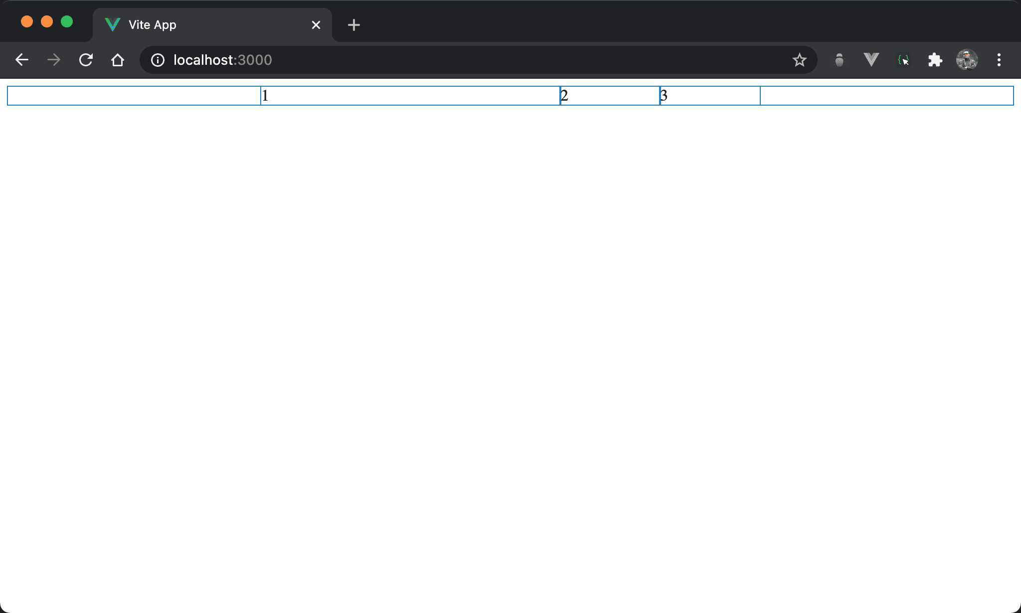
雖然有設定各子層 item 相同 width,但 item1 的 width 與眾不同。
<template>
  <div class="box">
    <div class="item item1">1</div>
    <div class="item">2</div>
    <div class="item">3</div>
  </div>
</template>

<style scoped>
.box {
  display: flex;
  width: 500px;
  margin: auto
}

.item {
  width: 33.33%
}

.item1 {
  flex-basis: 300px;
  flex-shrink: 0;
}
</style>
10 行
.box {
  display: flex;
  width: 500px;
  margin: auto
}
設定父層 box style:
display: flex:設定子層 item 使用 flexboxwidth: 500px:設定 box widthmargin: auto:設定自動調整 margin 而水平置中
16 行
.item {
  width: 33.33%
}
設定子層 item 共用 style:
width: 33.33%:子層 item width 各為1/3,所以會三分父層 box 寬度
20 行
.item1 {
  flex-basis: 300px;
  flex-shrink: 0;
}
設定子層 item1 特別 style:
flex-basis: 300px:使用flex-basis設定寬度,300px將取代33.33%flex-shrink: 0:由於子層 item 總寬度已經大於父層 box,會自動啟動收縮,特別在 item1 取消收縮方便觀察flex-basis
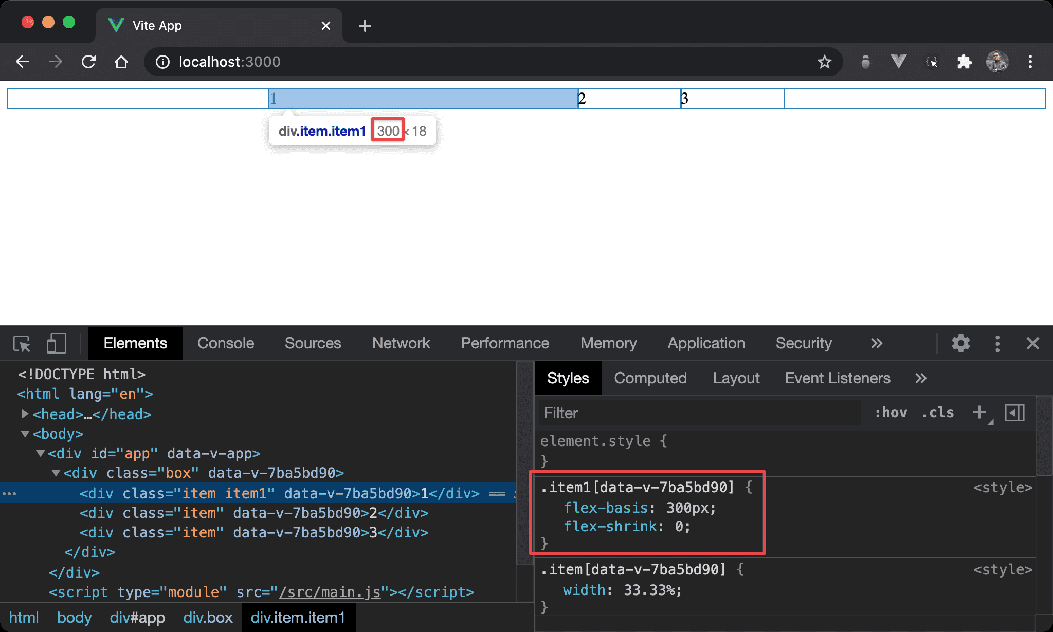
可發現 flex-basis 優先權大於 width,browser 最後採用 flex-basis 所設定的 300px。
Conclusion
flex-basis預設為auto,也就是參考width所設定;若有設定flex-basis則取代width- 假如
flex-direction改成column,則flex-basis相當於height flex-basis優點在於不會寫死width或height,只要flex-direction改變自動切換,適合 RWD 使用