雖然 flex-grow、flex-shrink 與 flex-basis 為 3 個獨立 property,但實務上常使用 flex 一次設定。
Version
CSS 3
flex: 1
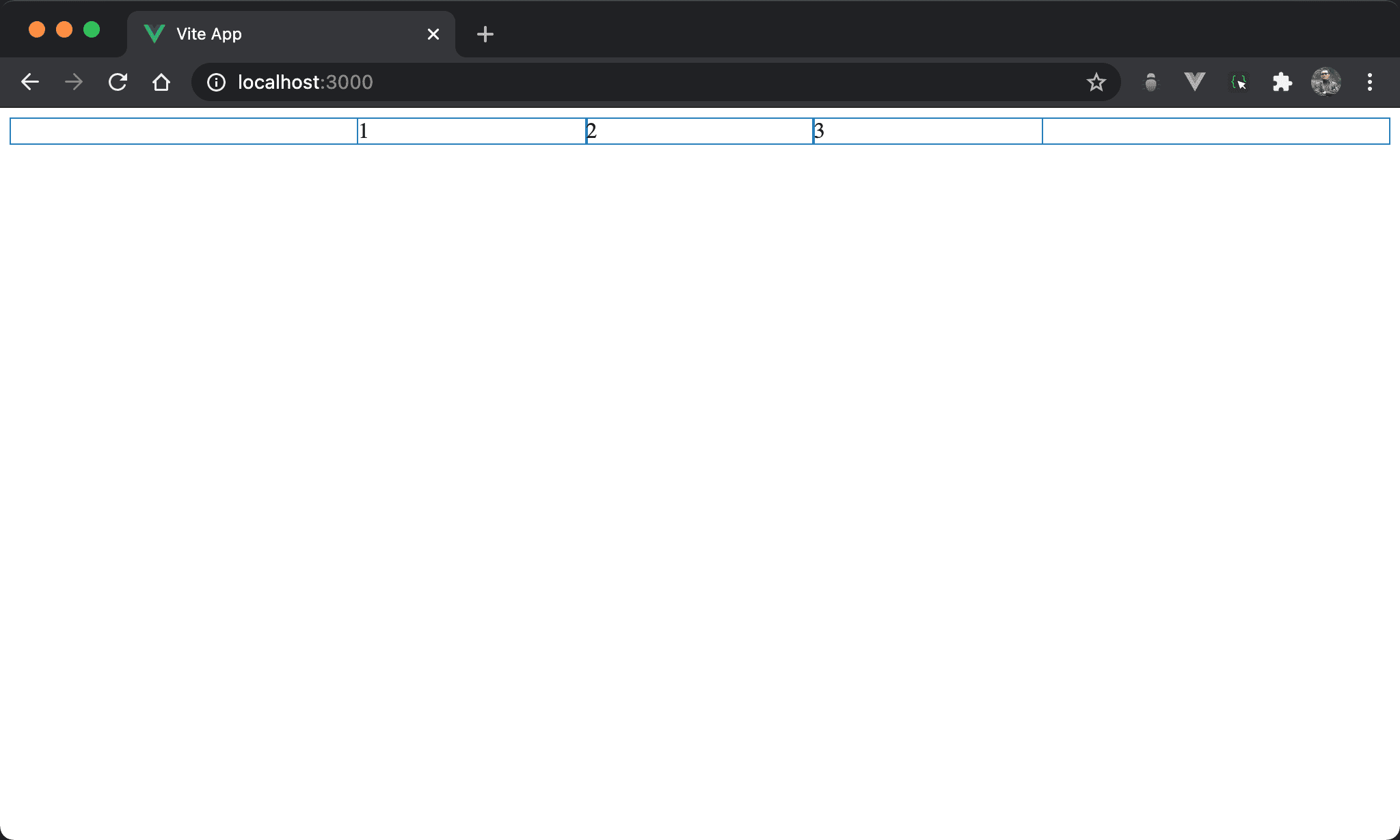
3 個子層 item 平分父層 box。
<template>
  <div class="box">
    <div class="item">1</div>
    <div class="item">2</div>
    <div class="item">3</div>
  </div>
</template>

<style scoped>
.box {
  display: flex;
  width: 500px;
  margin: auto
}

.item {
  flex: 1;
}
</style>
第 10 行
.box {
  display: flex;
  width: 500px;
  margin: auto
}
設定父層 box style:
display: flex:設定子層 item 使用 flexboxwidth: 500px:設定 box widthmargin: auto:設定自動調整 margin 而水平置中
第 6 行
.item {
  flex: 1;
}
設定子層 item style:
flex: 1:flex只設定一個值且沒有任何單位,這相當於:
.item {
  flex: 1 1 0;
}
或
.item {
  flex-grow: 1;
  flex-shrink: 1;
  flex-basis: 0;
}
其中 flex-basis 預設值為 auto,也就是由 width 決定,但 flex: 1 會強制將 flex-basis 設定為 0,也就是所有子層 item 寬度都是 0,只剩下父層 box 寬度,最後自動由 flex-grow 以 1 : 1 : … 平分父層 box 寬度。
若想平分父層 box 又不想手動設定
flex-basis,設定flex: 1是最簡單方式,實務上經常使用
flex: 300px
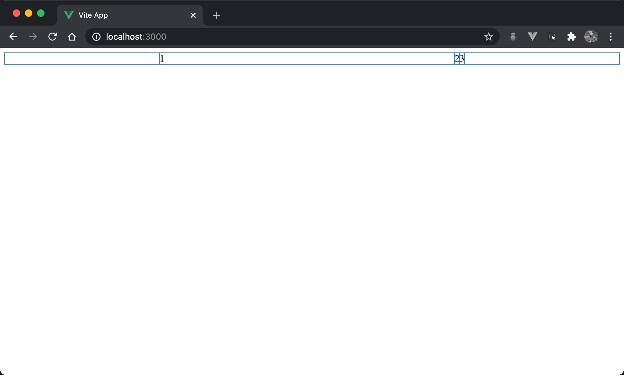
Item1 獨佔父層 box 剩餘寬度。
<template>
  <div class="box">
    <div class="item1">1</div>
    <div>2</div>
    <div>3</div>
  </div>
</template>

<style scoped>
.box {
  display: flex;
  width: 500px;
  margin: auto
}

.item1 {
  flex: 300px;
}
</style>
16 行
.item1 {
  flex: 300px;
}
設定子層 item1 特別 style:
flex: 300px只設定一個值而有單位,這相當於:
.item1 {
  flex 1 1 300px;
}
或
.item0 {
  flex-grow: 1;
  flex-shrink: 1;
  flex-basis: 300px;
}
300px 主要是設定 flex-basis,而 flex-grow 與 flex-shrink 都設定為 1。
也因為 flex-grow 設定為 1,其他 item 的 flex-grow 為 0,因此 item1 獨佔父層 box 剩餘寬度。
flex: 0 300px
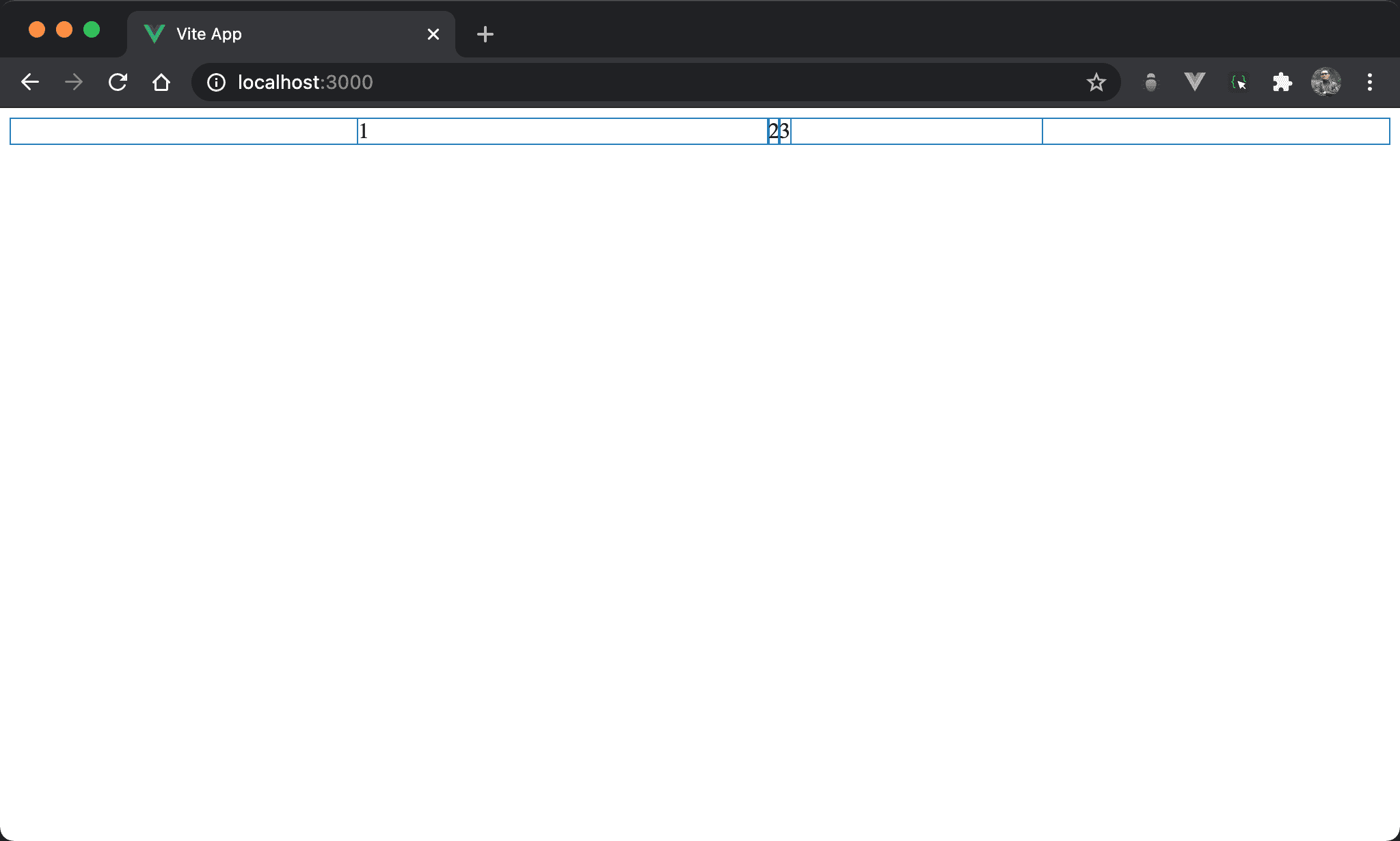
Item1 寬度為 300px,但沒瓜分父層 box 剩餘寬度,item3 之後還留有剩餘寬度。
<template>
  <div class="box">
    <div class="item1">1</div>
    <div>2</div>
    <div>3</div>
  </div>
</template>

<style scoped>
.box {
  display: flex;
  width: 500px;
  margin: auto
}

.item1 {
  flex: 0 300px;
}
</style>
16 行
.item1 {
  flex: 0 300px;
}
設定子層 item1 特別 style:
flex: 0 300px:flex只設定兩個值,一個沒單位,一個有單位,這相當於:
.item1 {
  flex: 0 1 300px;
}
或
.item0 {
  flex-grow: 0;
  flex-shrink: 1;
  flex-basis: 300px;
}
沒有單位的值是設定 flex-grow,有單位的值是設定 flex-basis。
因為
flex-grow為0,故 item1 沒有瓜分父層 box 剩餘寬度
flex: 1 0 300px
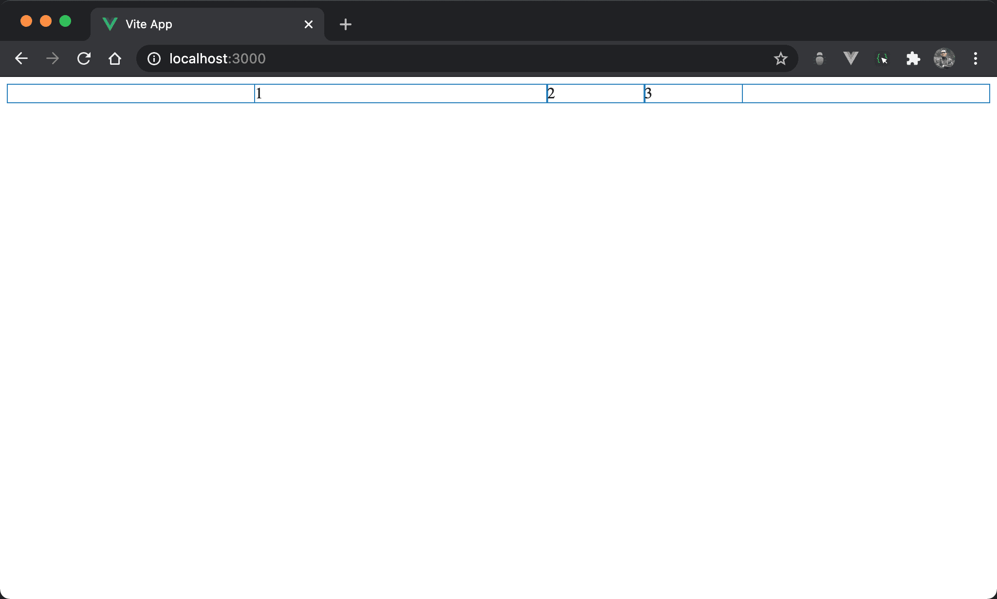
雖然子層 item 寬度總和大於父層 box,但 item1 寬度仍維持 300px 而沒有自動 shrink。
<template>
  <div class="box">
    <div class="item1">1</div>
    <div class="item2">2</div>
    <div class="item3">3</div>
  </div>
</template>

<style scoped>
.box {
  display: flex;
  width: 500px;
  margin: auto
}

.item1 {
  flex: 1 0 300px;
}

.item2 {
  width: 200px;
}

.item3 {
  width: 200px;
}
</style>
16 行
.item1 {
  flex: 1 0 300px;
}
設定 item1 子層特別 style:
flex: 1 0 300px:一次設定三個值,分別是flex-grow、flex-shrink與flex-basis,這相當於:
.item1 {
  flex-grow: 1;
  flex-shrink: 0;
  flex-basis: 300px;
}
也因為 flex-shrink 為 0,所以 item1 沒自動 shrink。
Conclusion
- 實務上會常用
flex一次設定,在 DevTool 看到的也是flex