align-items 是在父層 Box 設定,會影響所有子層 Item,若想只設定特定子層 Item 的 align-items 設定,或者在某子層 Item 覆蓋父層 Box 的 align-items 設定,則可使用 align-self。
Version
CSS 3
Specific Item
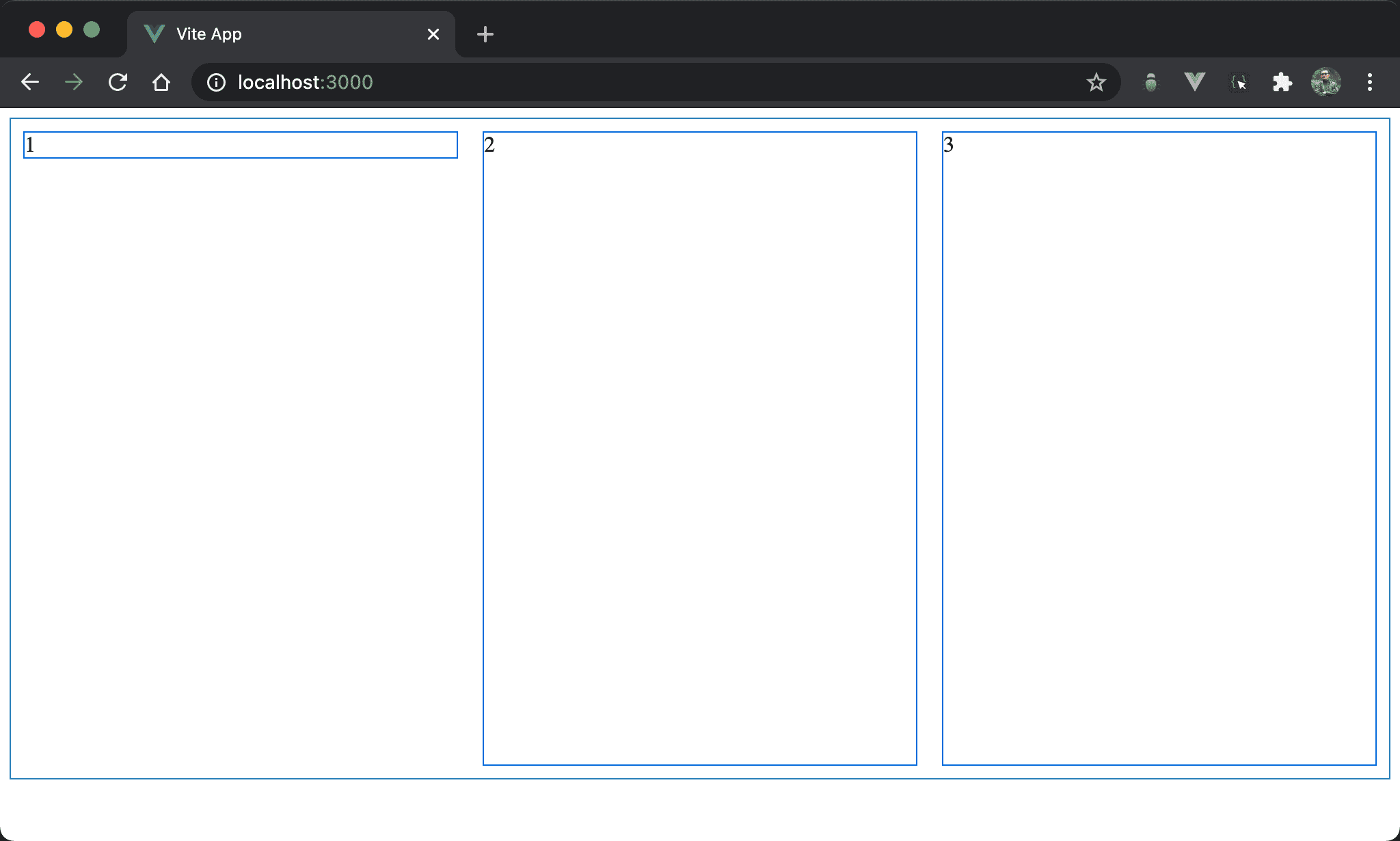
Item2 與 item3 受到預設 align-items: stretch 影響自動 stretch 成父層 box 高度,但唯獨 item1 沒有 stretch,而且還垂直靠上。
<template>
  <div class="box">
    <div class="item item1">1</div>
    <div class="item">2</div>
    <div class="item">3</div>
  </div>
</template>

<style scoped>
.box {
  display: flex;
  width: 100%;
  height: 90vh;
}

.item {
  width: 33%;
  margin: 10px;
}

.item1 {
  align-self: flex-start;
}
</style>
第 2 行
<div class="box">
  <div class="item item1">1</div>
  <div class="item">2</div>
  <div class="item">3</div>
</div>
box:設定父層 box styleitem:設定子層 item 共同 styleitem1:設定子層 item1 特別 style
10 行
.box {
  display: flex;
  width: 100%;
  height: 90vh;
}
設定父層 box style:
display: flex:設定子層 item 使用 Flexboxwidth: 100%:設定父層 box widthheight: 90vh:設定父層 box height
16 行
.item {
  width: 33%;
  margin: 10px;
}
設定子層 item 共用 style:
width: 33%:設定子層 item widthmargin: 10px:設定子層 item margin
21 行
.item1 {
  align-self: flex-start;
}
設定子層 item1 特別 style:
align-self: flex-start:父層 box 並沒有設定任何align-items: start,因此子層 item 皆以預設align-items: stretch自動 stretch 與父層 box 同高,但若希望 item1 能align-items: flex-start,則可用align-self單獨設定
margin: auto

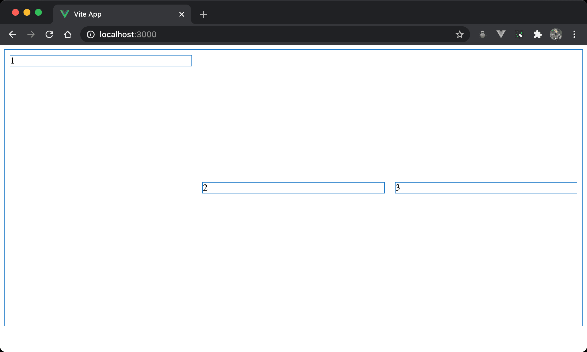
Item2 與 item3 自動 stretch 與父層 box 同高,而 item1 則垂直靠上。
<template>
  <div class="box">
    <div class="item item1">1</div>
    <div class="item">2</div>
    <div class="item">3</div>
  </div>
</template>

<style scoped>
.box {
  display: flex;
  width: 100%;
  height: 90vh;
}

.item {
  width: 33%;
  margin: 10px;
}

.item1 {
  margin-bottom: auto;
}
</style>
21 行
.item1 {
  margin-bottom: auto;
}
設定子層 item1 特別 style:
margin-bottom: auto:item1 並沒有設定align-self: flex-start,而是改用margin-bottom: auto,因為父層 box 已經有設定 height,所以垂直方向有空間讓margin: auto動態調整 margin 而垂直靠上
可發現
align-self: flex-start可用margin-bottom: auto取代
Override align-items
Item2 與 item3 都已經垂直置中,唯 item1 仍是垂直靠上。
<template>
  <div class="box">
    <div class="item item1">1</div>
    <div class="item">2</div>
    <div class="item">3</div>
  </div>
</template>

<style scoped>
.box {
  display: flex;
  align-items: center;
  width: 100%;
  height: 90vh;
}

.item {
  width: 33%;
  margin: 10px;
}

.item1 {
  align-self: flex-start;
}
</style>
10 行
.box {
  display: flex;
  align-items: center;
  width: 100%;
  height: 90vh;
}
設定父層 box style:
align-items: center:由於 item2 與 item3 都是垂直置中,因此將align-items: center設定在父層,可一次影響所有子層 item 設定
22 行
.item1 {
  align-self: flex-start;
}
設定 item1 特別 style:
align-self: flex-start:只有 item1 要垂直靠上,因此使用align-self: flex-start單獨設定,可覆蓋父層 box 的align-items: center
margin: auto
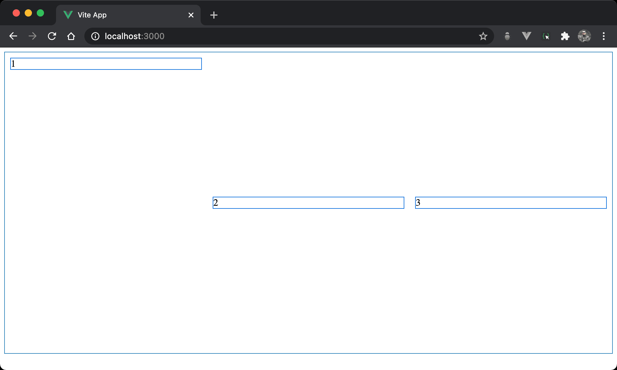
Item2 與 item3 都已經垂直置中,唯 item1 仍是垂直靠上。
<template>
  <div class="box">
    <div class="item item1">1</div>
    <div class="item">2</div>
    <div class="item">3</div>
  </div>
</template>

<style scoped>
.box {
  display: flex;
  align-items: center;
  width: 100%;
  height: 500px;
}

.item {
  width: 33%;
  margin: 10px;
}

.item1 {
  margin-bottom: auto;
}
</style>
22 行
.item1 {
  margin-bottom: auto;
}
設定子層 item1 特別 style:
margin-bottom: auto:item1 並沒有設定align-self: flex-start覆蓋父層 box 的align-items: center,而是改用margin-bottom: auto,因為父層 box 已經有設定 height,所以垂直方向有空間讓margin: auto動態調整 margin 而垂直靠上
可發現
align-self: flex-start可用margin-bottom: auto取代
Conclusion
align-self可視為align-items的子層版,只針對特定 item 設定- 也因為
align-self多數可以使用margin: auto實現,因此實務上較少使用align-self