如 Youtube 本質上就是 <iframe>,但若要能讓 Youtube 也 RWD,則必須搭配一些 CSS 技巧。
Version
CSS 3
iframe
Canvas 可隨著 browser 寬高改變而自動改變。
<template>
  <div class="box">
    <iframe width="560" height="315" src="https://www.youtube.com/embed/FXI_-OesT3A" frameborder="0" allow="accelerometer; autoplay; clipboard-write; encrypted-media; gyroscope; picture-in-picture" allowfullscreen></iframe>
  </div>
</template>

<style scoped>
.box {
  width: 90%;
  position: relative;
}

.box::before {
  content: '';
  display: block;
  width: 100%;
  padding-bottom: 56.25%;
}

.box iframe {
  position: absolute;
  width: 100%;
  height: 100%;
  top: 0;
  left: 0;
}
</style>
第 2 行
<div class="box">
  <iframe width="560" height="315" src="https://www.youtube.com/embed/FXI_-OesT3A" frameborder="0" allow="accelerometer; autoplay; clipboard-write; encrypted-media; gyroscope; picture-in-picture" allowfullscreen></iframe>
</div>
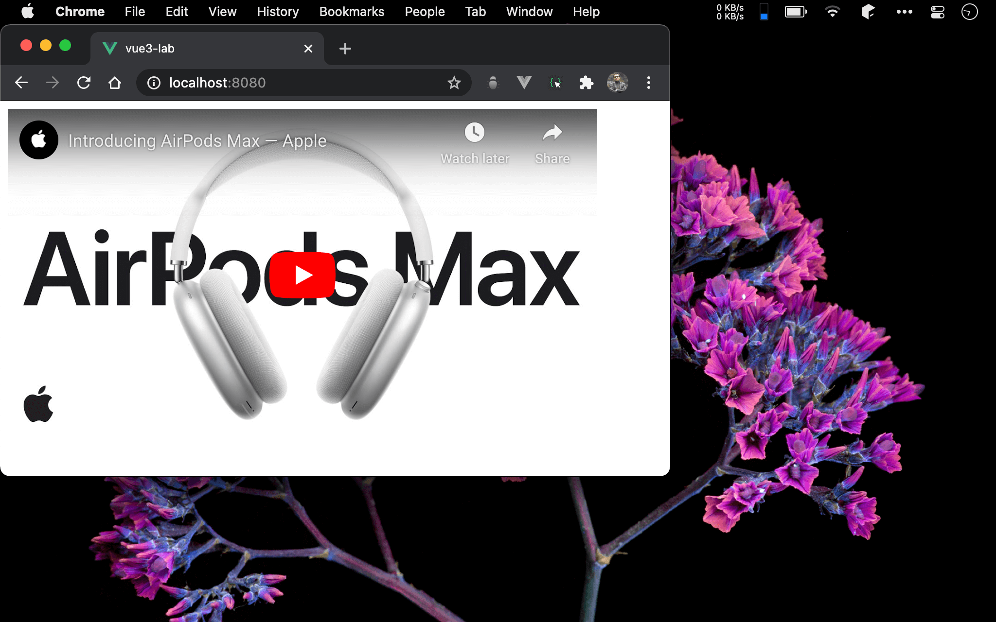
當使用 Youtube 的 share embed 時,它會給你一段 <iframe>,且 width 固定為 560,height 為 315。
為了使 Youtube 能 RWD,我們在 <iframe> 外包一個 <div>,將以此 .box 控制 。
13 行
.box::before {
  content: '';
  display: block;
  width: 100%;
  padding-bottom: 56.25%;
}
使用 ::before 建立一個虛擬的 <div>
content: '':沒有任何內容故為 empty stringdisplay: block:如<div>為 block elementwidth: 100%:width由 parent 的width決定,100%表示跟 parent 的width相等padding-bottom: 56.25%:在此padding-bottom相當於 height, 由於其亦由 parent 的width決定,目前width已經100%跟 parent 相等,padding-bottom只要計算出height/width的百分比即可,也就是315/560*100% = 56.25%
20 行
.box iframe {
  position: absolute;
  width: 100%;
  height: 100%;
  top: 0;
  left: 0;
}
之前已經使用 ::before 建立出虛擬 <div> 建立空間,只要使用絕對定位將圖片覆蓋在虛擬 <div> 上即可。
width: 100%:取代原本width的640,改與 parent width100%相等height: 100%:取代原本height的480,改與 parent height100%相等
第 8 行
.box {
  width: 90%;
  position: relative;
}
由於 ::before 所建立的 <div> 與 .box canvas 都由 parent 的 width 決定,因此 .box 的 width 成為一開始顯示寬度的關鍵。
Conclusion
- 這種方式可視為 pattern 使用,唯
padding-bottom需根據實際的 height / width 計算,且box的 width 也須視需求指定 - 由於 Youtube 固定為
width=560,height=315,因此padding-bottom固定為56.25%,只剩下.box的width需設定百分比