若我們希望 <div> 能根據 Browser 的長寬自動改變,直覺會想將 width 與 height 都設定成百分比,但事實上沒這麼單純。
Version
CSS 3
Height with Percent
<template>
  <div class="box"/>
</template>

<style scoped>
.box {
  width: 50%;
  height: 50%;
  background: #f00;
}
</style>
若想 <div> 能 resizable,直覺會將 width 與 height 都設定成百分比。
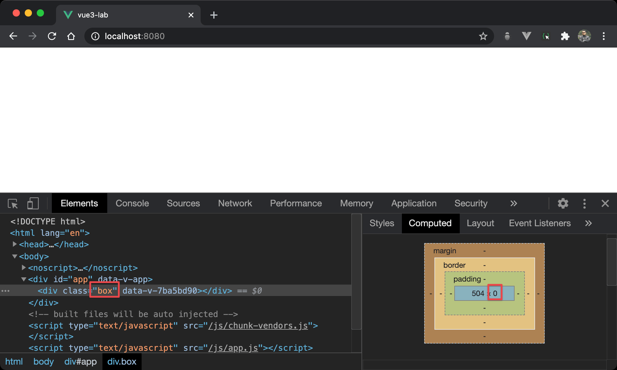
但會發現 height 為 0 而無法顯示。
主要因為 height: 50% 是根據 parent element 的 height 取 50%,其 parent 並沒有指定 height,而是由其 child 所撐開,因為 <div> 沒內容,故 height 為 0,其 parent 也為 0,取 50% 之後仍為 0。
Padding with Percent
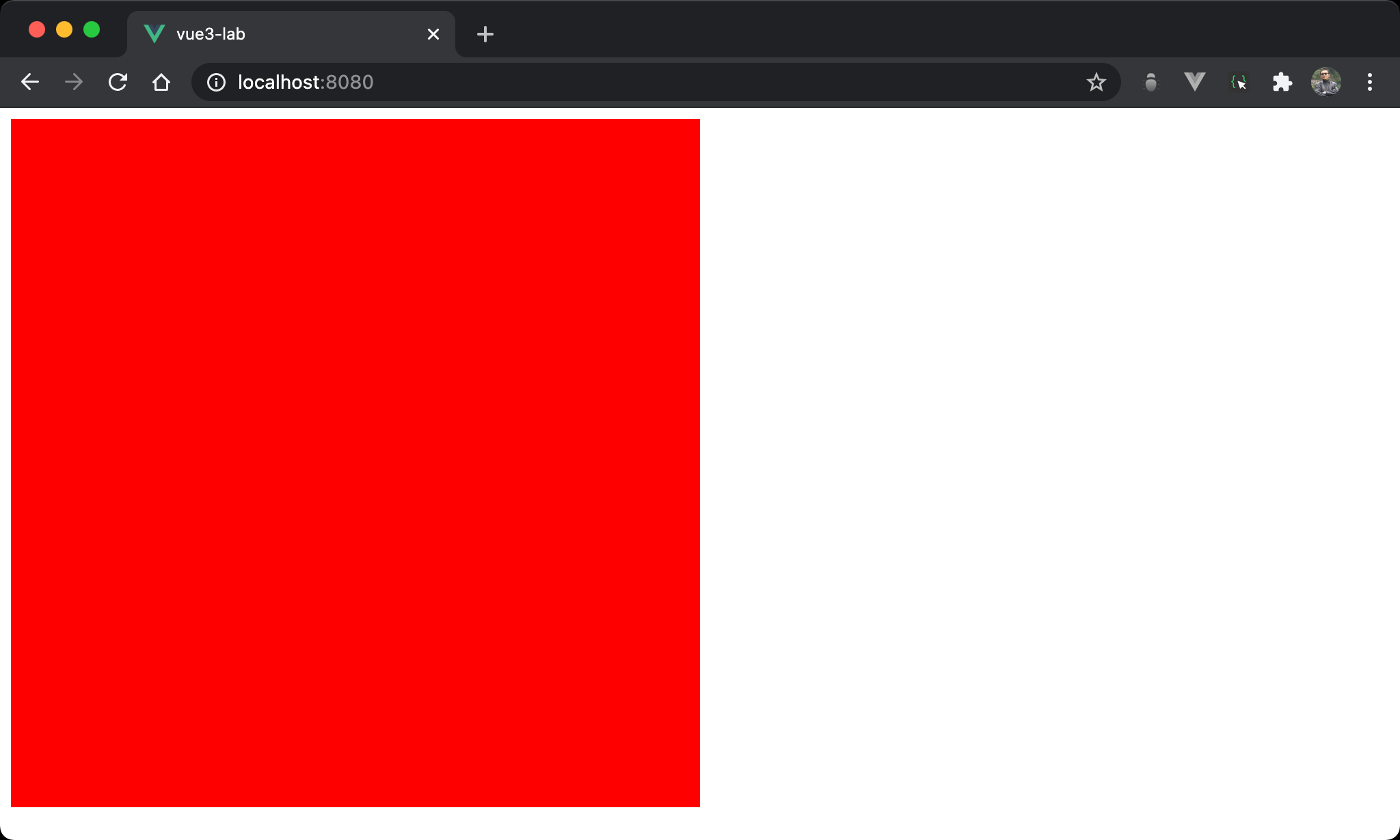
<div> 的 width 與 height 相等。
且當 browser resize 時,<div> 也會動態跟著改變。
<template>
  <div class="box"/>
</template>

<style scoped>
.box {
  width: 50%;
  padding-bottom: 50%;
  background: #f00;
}
</style>
第 6 行
.box {
  width: 50%;
  padding-bottom: 50%;
  background: #f00;
}
padding-bottom: 50%:雖然也是設定50%,但padding-bottom會根據 parent 的 width 取50%,因為 RWD 主要是改變 width,所以padding-bottom會跟著改變
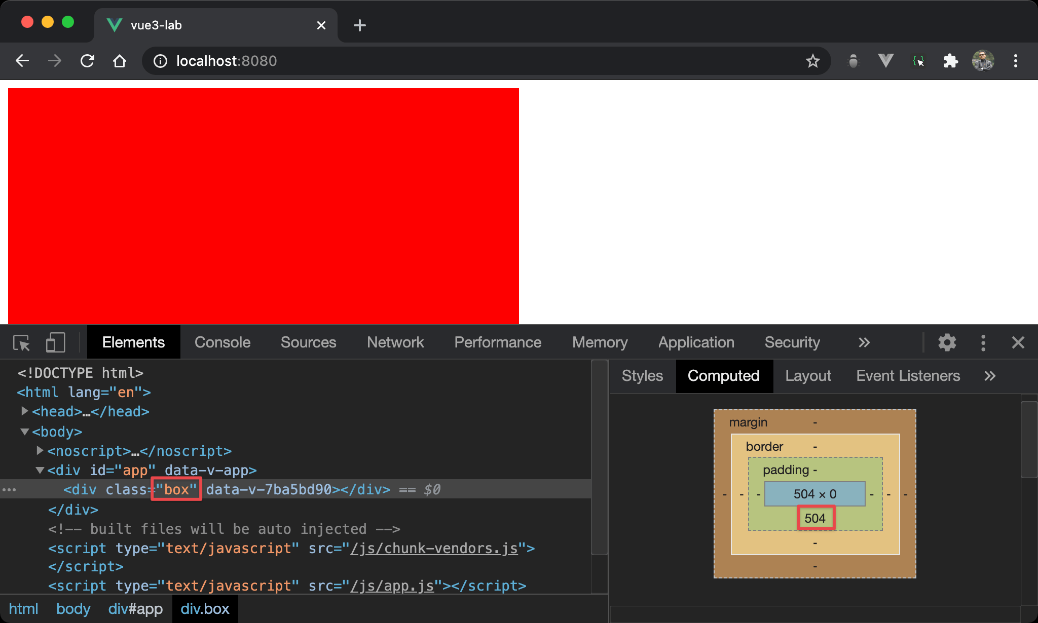
改變 padding-bottom 有什麼用呢 ?
在 Box Model 下,雖然 height 依然為 0,但 <div> 可藉由 padding-bottom 撐起高度,因此 <div> 不會再因為 height 為 0 無法顯示。
Conclusion
- 這個技巧的關鍵在於
padding-bottom會根據 parent 的 width 計算而不是 height,而 RWD 本來就是改變 width,藉由padding-bottom的改變而使得<div>的高度隨 RWD 改變