實務上常遇到一堆 Item 都靠左,但最後一個 Item 靠右,這種常見需求可使用 flex-grow 或 margin: auto 達成。
Version
CSS 3
flex-grow
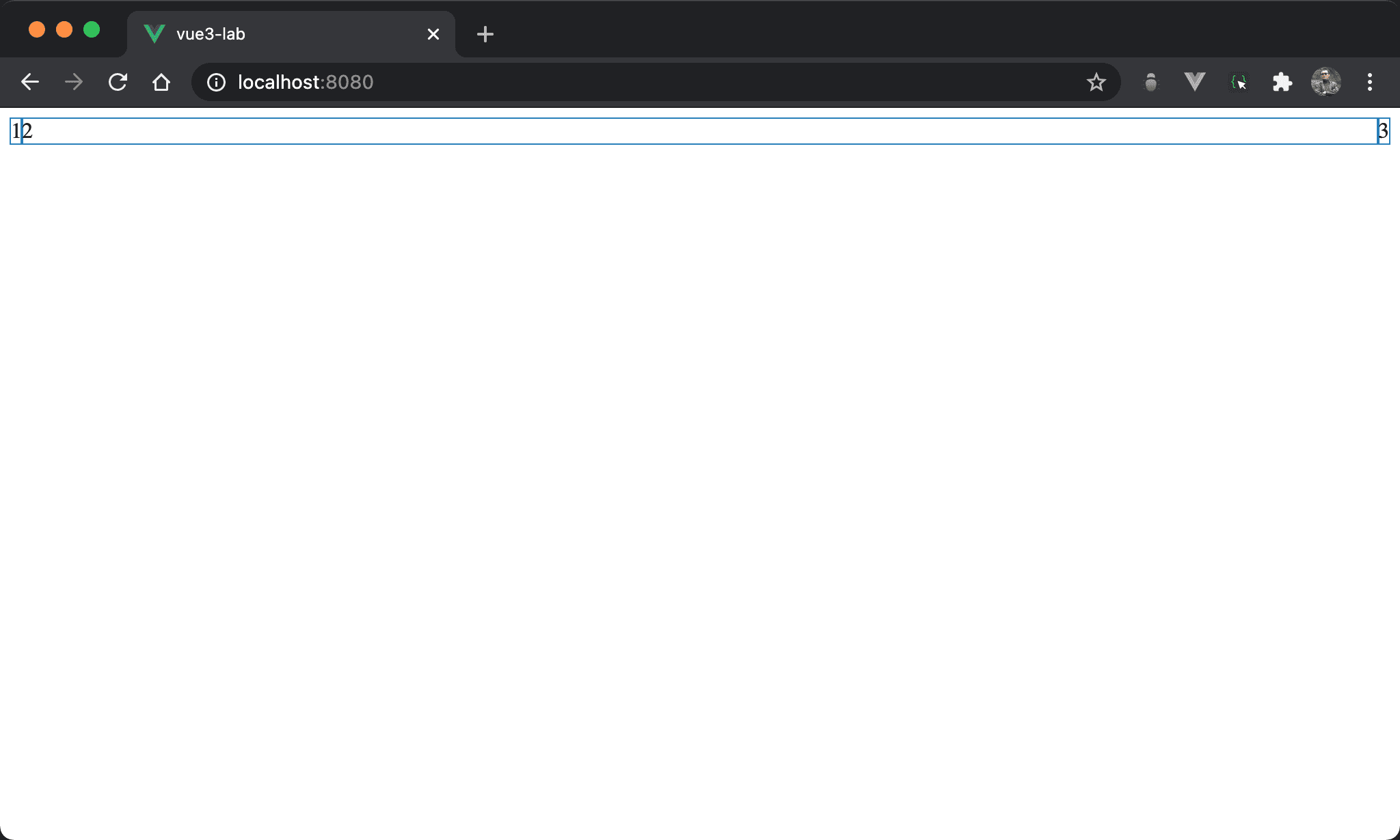
1 與 2 連續靠左,但 3 卻是靠右。
<template>
  <div class="box">
    <div>1</div>
    <div class="item2">2</div>
    <div>3</div>
  </div>
</template>

<style scoped>
.box {
  display: flex
}

.item2 {
  flex-grow: 1
}
</style>
10 行
.box {
  display: flex
}
display: flex:使用 Flexbox
14 行
.item2 {
  flex-grow: 1
}
設定 item2 特有 property:
flex-grow: 1:使用剩餘空間,因此看起來1與2都會靠左,只有3會靠右
margin: auto
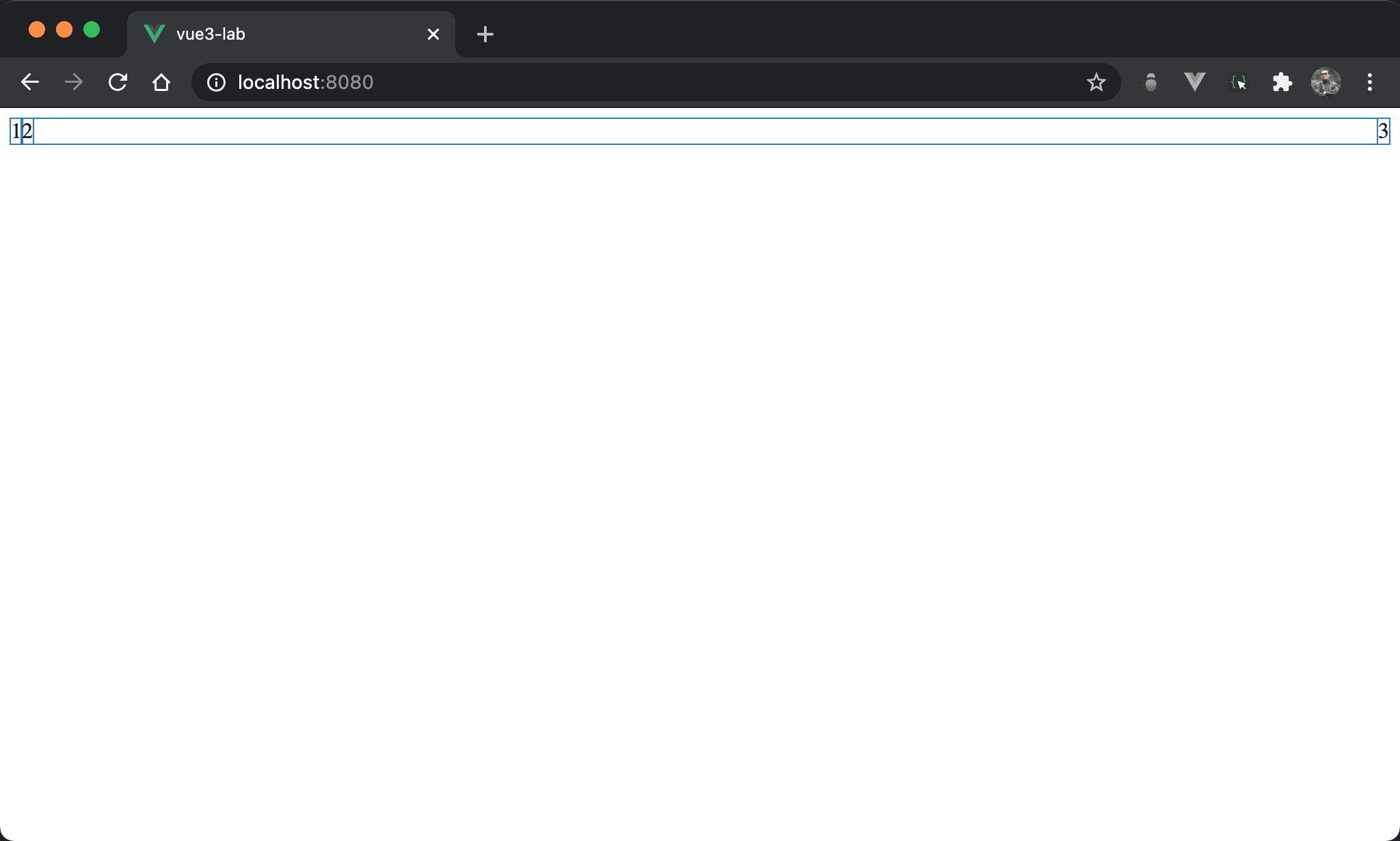
1 與 2 連續靠左,但 3 卻是靠右。
<template>
  <div class="box">
    <div>1</div>
    <div class="item2">2</div>
    <div>3</div>
  </div>
</template>

<style scoped>
.box {
  display: flex
}

.item2 {
  margin-right: auto;
}
</style>
10 行
.box {
  display: flex
}
display: flex:使用 Flexbox
14 行
.item2 {
  margin-right: auto;
}
設定 item2 特有 property:
margin-right: auto:根據剩餘空間自動調整 right margin,因此看起來1與2都會靠左,只有3會靠右
Conclusion
flex-grow或margin: auto實現方式都很簡單,可視個人喜好選擇