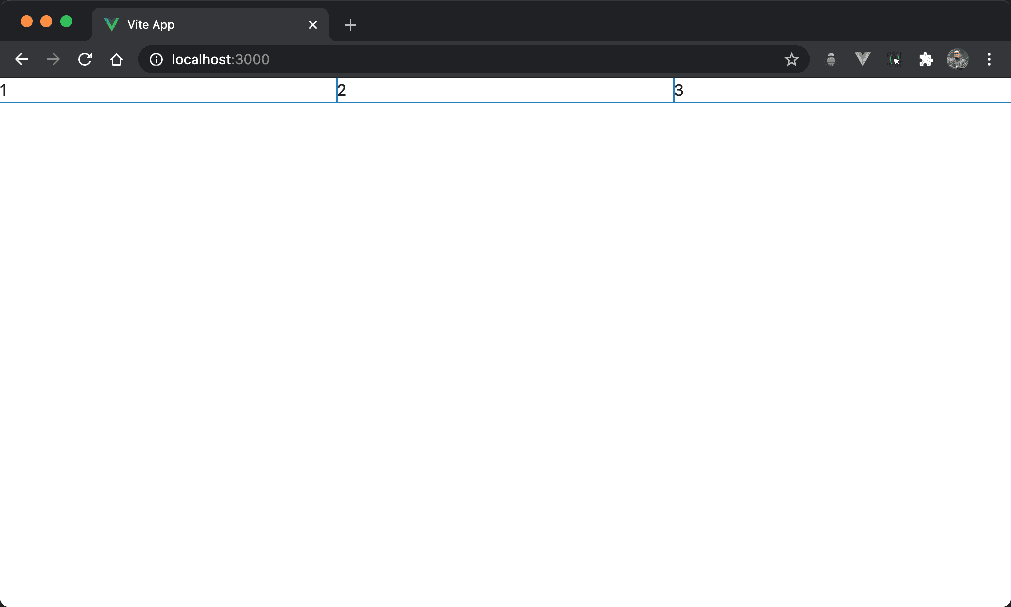
在 Main Axis 水平均分 N 個 Column 為實務上常見需求,在 CSS 有多種方式實現。
Version
CSS 3
calc()
子層 item 水平三分父層 section 寬度,使用 calc() 從子層 item 下手。
<template lang='pug'>
section
  .item 1
  .item 2
  .item 3
</template>

<style lang='sass' scoped>
*
  --columns: 3

section
  display: flex

.item
  width: calc(100%/var(--columns))
</style>
12 行
section
  display: flex
設定父層 section style:
display: flex:設定子層 item 使用 Flexbox,主要為了使子層 item 能橫排
第 9 行
*
  --columns: 3
使用 CSS variable 定義 column 數。
15 行
.item
  width: calc(100%/var(--columns))
設定子層 item style:
width: calc(100%/var(--columns)):直覺會直接從width下手,可使用calc()根據--columns動態計算出 子從 item width
flex-grow
子層 item 水平三分父層 section 寬度,使用 flex-grow 從子層 item 下手。
<template lang='pug'>
section
  .item 1
  .item 2
  .item 3
</template>

<style lang='sass' scoped>
section
  display: flex

.item
  flex-grow: 1
</style>
第 9 行
section
  display: flex
設定父層 section style:
display: flex:設定子層 item 使用 Flexbox,主要為了使子層 item 能橫排
12 行
.item
  flex-grow: 1
設定子層 item style:
flex-grow: 1:item1、item2 與 item3 的flex-grow皆相同,因此寬度比例相同而均分
flex: 1
子層 item 水平三分父層 section 寬度,使用 flex 從子層 item 下手。
<template lang='pug'>
section
  .item 1
  .item 2
  .item 3
</template>

<style lang='sass' scoped>
section
  display: flex

.item
  flex: 1
</style>
14 行
.item
  flex: 1
設定子層 item style:
flex: 1:相當於
.item
  flex: 1 1 0
或
.item
  flex-grow: 1
  flex-shrink: 1
  flex-basis: 0
其中 flex-basis 預設值為 auto,也就是由 width 決定,但 flex: 1 會強制將 flex-basis 設定為 0,也就是所有子層 item 寬度都是 0,只剩下父層 box 寬度,最後自動由 flex-grow 以 1 : 1 : … 平分父層 box 寬度。
grid-template-columns
子層 item 水平三分父層 section 寬度,使用 grid-template-columns 從父層 section 下手。
<template lang='pug'>
section
  div 1
  div 2
  div 3
</template>

<style lang='sass' scoped>
section
  display: grid
  grid-template-columns: repeat(3, auto)
</style>
第 9 行
section
  display: grid
  grid-template-columns: repeat(3, auto)
設定父層 section style:
display: grid:設定子層使用 Gridgrid-template-columns: repeat(3, auto):argument 個數決定 column 個數,若要由 browser 自行根據剩餘寬度分配則填入auto
三個都是
auto相當於水平三分
repeat(n, 1fr)
子層 item 水平三分父層 section 寬度,使用 grid-template-columns 從父層 section 下手,但改由 fr 實現。
<template lang='pug'>
section
  div 1
  div 2
  div 3
</template>

<style lang='sass' scoped>
section
  display: grid
  grid-template-columns: repeat(3, 1fr)
</style>
第 9 行
section
  display: grid
  grid-template-columns: repeat(3, 1fr)
設定父層 section style:
display: grid:設定子層使用 Gridgrid-template-columns: repeat(3, 1fr):3 個 column 都佔據剩餘寬度,但比例相同,因此相當於均分水平寬度
grid-auto-flow
子層 item 水平三分父層 section 寬度,使用 grid-auto-flow 從父層 section 下手。
<template lang='pug'>
section
  div 1
  div 2
  div 3
</template>

<style lang='sass' scoped>
section
  display: grid
  grid-auto-flow: column
</style>
第 9 行
section
  display: grid
  grid-auto-flow: column
設定父層 section style:
display: grid:設定子層 item 使用 Gridgrid-auto-flow: column:自動根據子層 item 個數水平均分 column
Conclusion
calc()與 Flexbox 是從子層 item 下手,而 Grid 是從父層 box 下手flex: 1本質還是使用flex-grow,只是使用了 shorthandgrid-template-columns可使用auto或1fr實現水平均分- Grid 的
grid-auto-flow: column會根據子層 item 個數自動水平均分,是最聰明方式