若要對影像實作灰階效果,可使用 :before 搭配 mix-blend-mode: color 實現。
Version
CSS 3
Image Effect
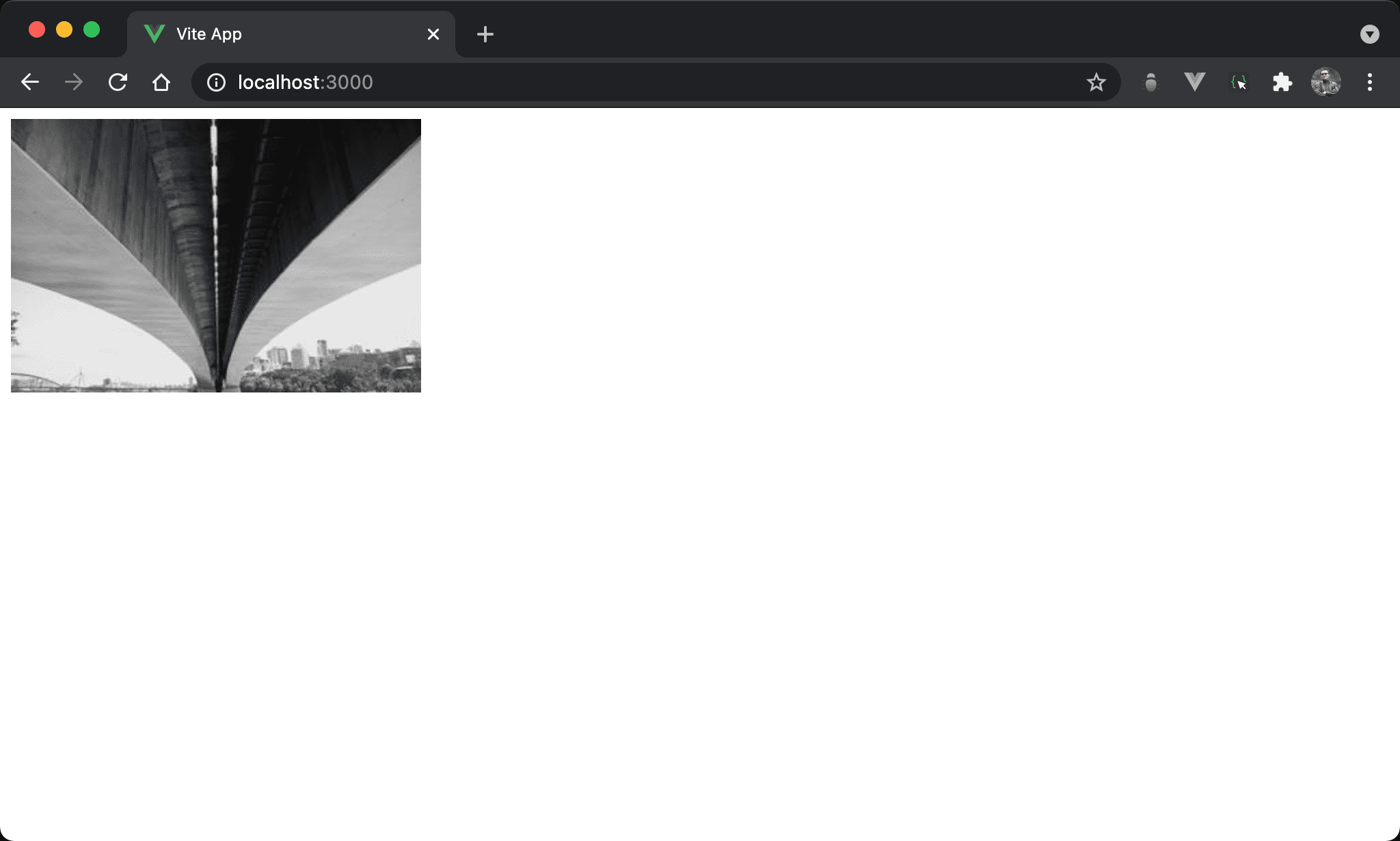
彩色圖片改以灰階顯示。
<template>
  <figure class="effect-box">
    <img src="https://picsum.photos/300/200/?random=10" alt="scenery">
  </figure>
</template>

<style scoped>
.effect-box {
  display: flex;
  width: fit-content;
  margin: 0;
  position: relative;
}

.effect-box:before {
  content: '';
  width: 100%;
  height: 100%;
  position: absolute;
  top: 0;
  left: 0;
  background: #939393;
  mix-blend-mode: color;
}
</style>
第 2 行
<figure class="effect-box">
  <img src="https://picsum.photos/300/200/?random=10" alt="scenery">
</figure>
由於要使用新的 layer 使用 absolute position,因此在 <img> 外需有一個 container 可用 relative position。
雖然也可使用
<div>,但由於是<img>,使用 HTML 5 的<figure>語意更佳
第 8 行
.effect-box {
  display: flex;
  width: fit-content;
  margin: 0;
  position: relative;
}
設定父層 box style:
display: flex:使<figure>高度能內縮至<img>高度width: fit-content:使<figure>寬度能內縮至<img>寬度margin: 0:設定<figure>的 marginposition: relative:即將使用:before新增一層 layer 為 absolute position,設定成 relative position 使之以此為定位基準
15 行
.effect-box:before {
  content: '';
  position: absolute;
  width: 100%;
  height: 100%;
  top: 0;
  left: 0;
  background: #939393;
  mix-blend-mode: color;
}
使用 :before 對圖片進行灰階效果:
content: '':為了能使用:before建立新 layer,儘管沒有任何內容,content仍要設定 empty string,否則無法使用:beforeposition: absolute:設定使用 absolute positionwidth: 100%:設定寬度與<figure>同寬height: 100%:設定高度與<figure>同高top: 0:設定上緣與<figure>對齊left: 0:設定左側與<figure>對齊background: #939393:設定背景顏色為灰色mix-blend-mode: color:設定背景顏色與<img>混色產生灰階效果
Conclusion
<img>外層 container 也可使用<div>,但<img>使用 HTML 5 的<figure>語意更佳- 仍然是常用的藉由
:before或:after新增 layer,然後透過 relative postion 與 absolute position 合作產生效果,這是:before與:after慣用 pattern