Block Element 預設會以 width: 100% 佔據父層 Box 所有寬度,這使得 margin: auto 無用武之地,可使用 width: fit-content 將寬度收縮成 Content 寬度,讓 margin: auto 能水平置中。
Version
CSS 3
Block Element
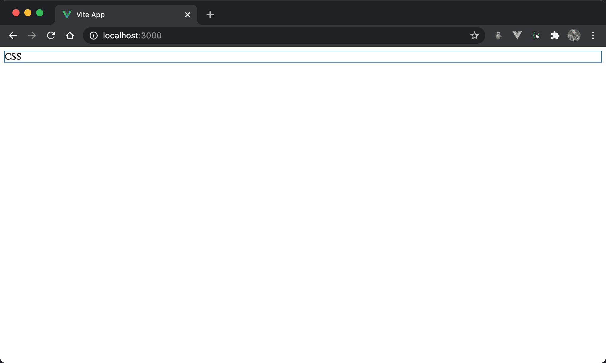
若只使用 block element,會發現 block 佔據一整列,其寬度佔據父層 box 所有寬度。
<template>
  <div>CSS</div>
</template>
只使用單純 <div>。
width: fit-content
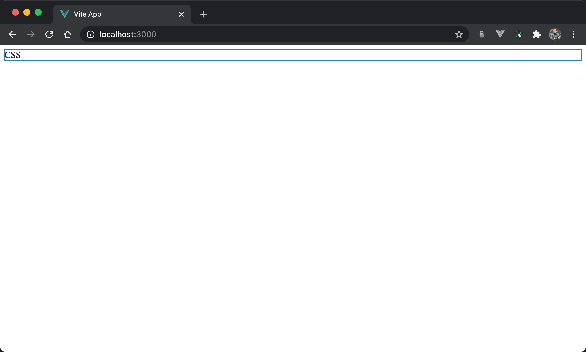
CSS 寬度內縮成只與 content 同寬。
<template>
  <div class="box">CSS</div>
</template>

<style scoped>
.box {
  width: fit-content;
}
</style>
第 6 行
.box {
  width: fit-content;
}
設定父層 box style:
width: fit-content:設定 width 改為與 content 同寬
margin: auto
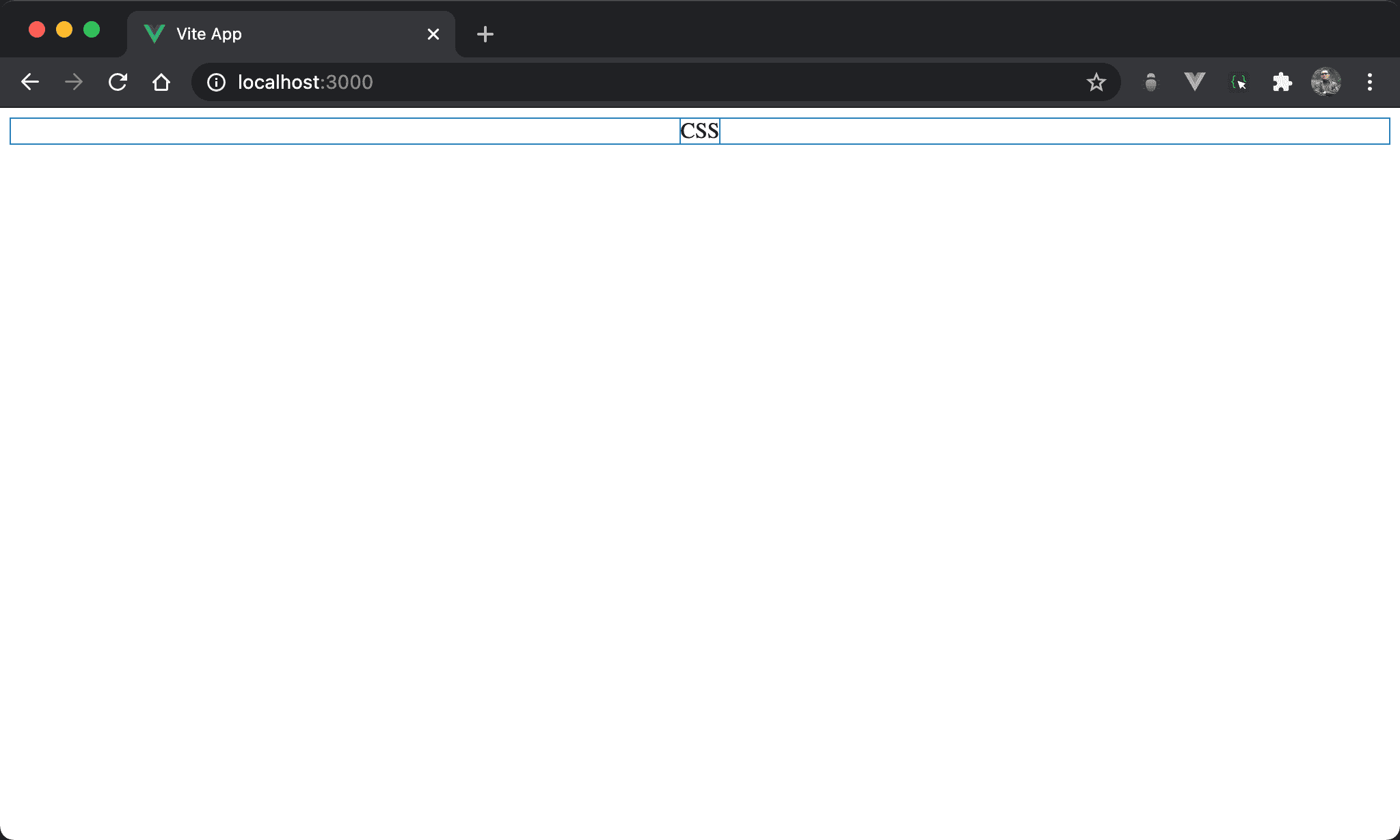
CSS 水平置中。
<template>
  <div class="box">CSS</div>
</template>

<style scoped>
.box {
  width: fit-content;
  margin: auto;
}
</style>
第 6 行
.box {
  width: fit-content;
  margin: auto;
}
設定父層 box style:
width: fit-content:設定 width 改為與 content 同寬margin: auto:自動調整左右 margin 而水平置中
Conclusion
width: fit-content使得 block element 也能寬度與 content 同寬,這使得margin: auto也能水平置中